Here’s iOS 11 beta vs iOS 10 visual differences comparison in side-by-side screenshots on iPhone and iPad devices.
Apple’s iOS 11 announcement during the WWDC opening keynote on Monday gave us our first glimpse yet of what the next big release for your iPhone and iPad will look like and even though there was plenty of time spent on-stage giving us a walkthrough of what we can expect come the big release, there are still plenty of things that we were not shown.
Over the coming days and weeks, and with each new beta release, we are sure to see new features and changes pop up as we find them, and we would argue that’s all part of the fun of a big new iOS release. We are only a couple of days into playing around with the initial iOS 11 developer preview but we have already spotted a few graphical and user interface changes to various elements within the release that Apple did not mention during its keynote. Below, we have highlighted some of the many UI differences between iOS 11 beta and iOS 10 that we have come across so far.
Note: All iOS 11 screenshots are on the left side, while iOS 10 are on the right side.
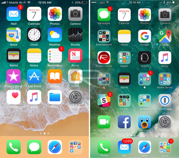
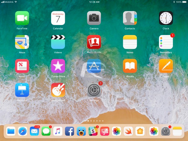
Home screen: iTunes and App Store have got fresh new icons in iOS 11.
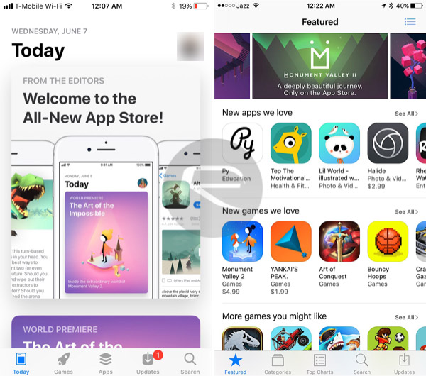
App Store: One of the biggest differences that you will likely notice is the redesigned App Store interface, and while we cannot quite decide yet whether we like it, it does have promise.
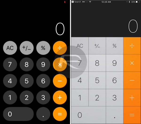
Calculator: Now, we know that the Calculator is far from the most exciting app baked into iOS, but it’s had a lick of paint for iOS 11 with round buttons the order of the day.
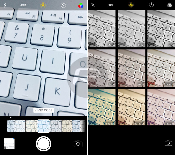
Camera app effects: With iOS 11, the Camera app will display the available effects and live previews differently. This is one change I’m are not sure about, but it might grow on me.
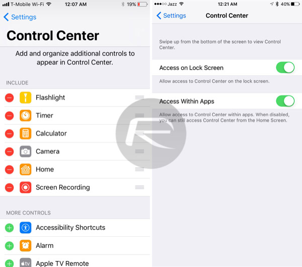
Control Center settings: The options for Control Center were minimal to say the least, but as of iOS 11, there are toggles for choosing exactly what will, or will not be displayed, for customizing toggles and more.
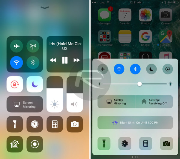
Control Center: Speaking of Control Center, the whole thing has been redesigned to make better use of space and offer more toggles without the need for pages.
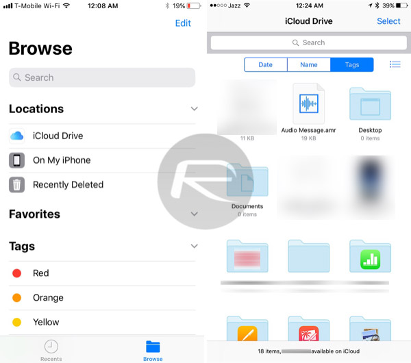
Files: The old iCloud Drive app has been replaced with Files, the nearest thing to the Mac’s Finder you are going to find on iOS.
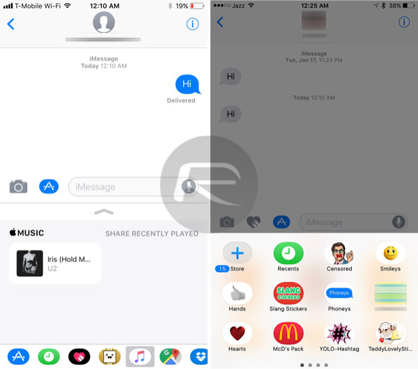
Messages app drawer: Apple has redesigned the app drawer within the Messages app to make it more accessible and organized.
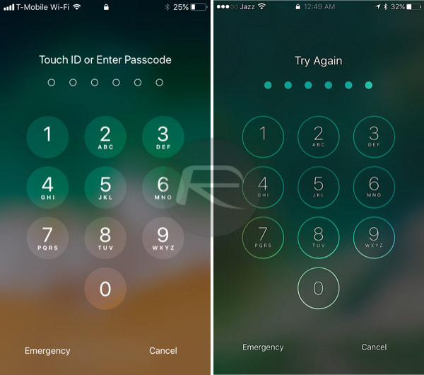
Lock screen Passcode entry: The number buttons on the lock screen passcode entry interface have been changed slightly.
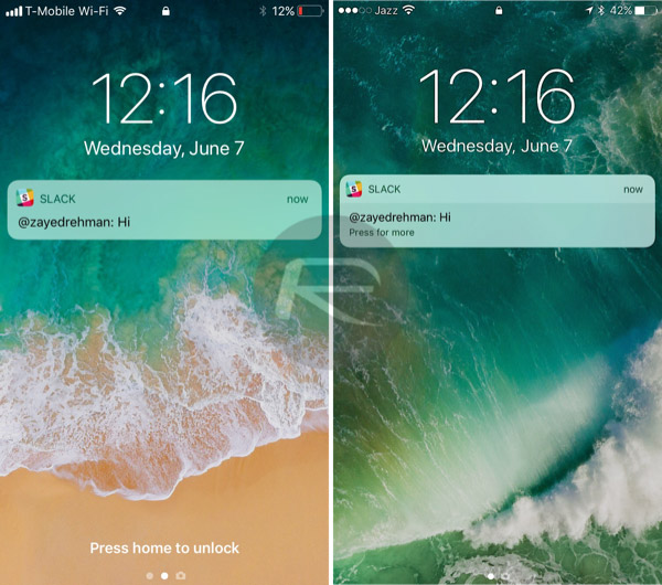
Lock screen: The lock screen itself has had a change in the way information is presented.
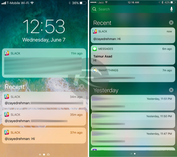
Notification Center: Apple has tweaked the way notifications are displayed.
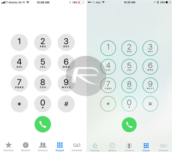
Phone app: In much the same way that the numbers on the Lock screen’s passcode entry interface have changed, so have the numbers in the Phone app’s dialer.
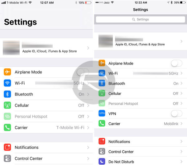
Settings: Finally, the Settings app has received some attention with a new interface that looks less utilitarian and more modern.
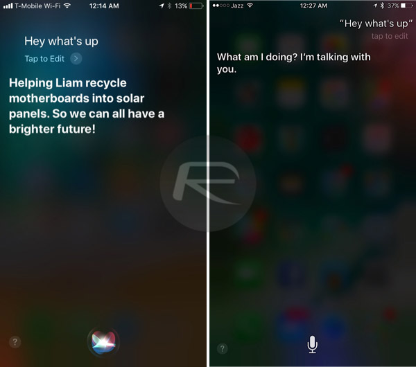
Siri: While speaking with Siri is the main aim, the way it looks on-screen has been adjusted a little, with a different blur effect and icons.
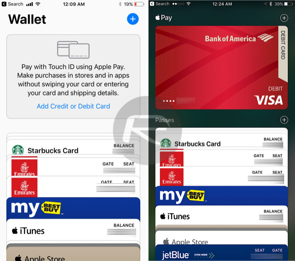
Wallet: an app that can be often forgotten about, Wallet is now very, very flat in its design. We are not sure that it will stay that way through future beta iterations, however. It doesn’t quite feel right, somehow.
iPad Home screen with new Dock: The iPad’s Dock has grown to look and behave more like the Mac’s, with many more apps now able to live there.

iPad Dock: Can appear in apps for switching between Slide Over, Split View etc.
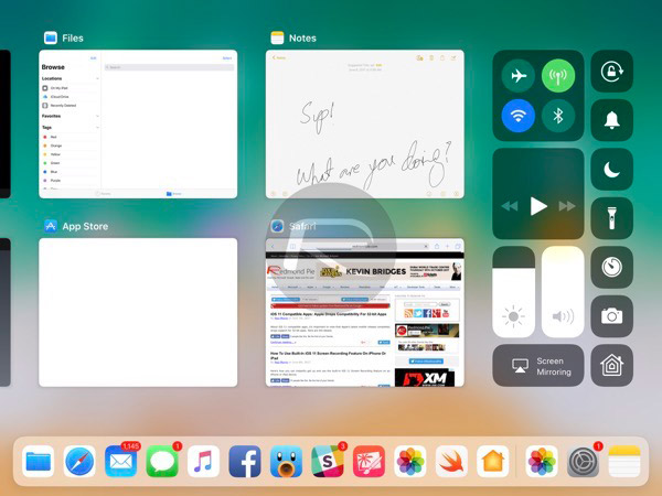
iPad app switcher: When launching the redesigned app switcher on the iPad, users will now notice that there is also an area dedicated to Control Center, making better use of the iPad’s larger screen.
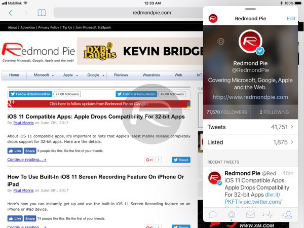
Multitasking on iPad: Apple has taken some of the complaints about the iPad’s Slide Over feature and provided a floating window as an improvement.
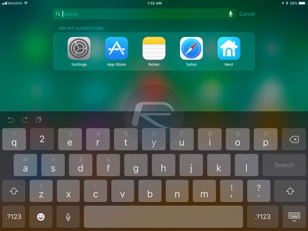
iPad keyboard numbers: The iPad’s keyboard now includes numbers across the top row of letters, just begging to be used with a swipe gesture.
You may also like to check out:
- iOS 11 Dark Mode: Enable Smart Invert Feature On iPhone, Here’s How
- How To Use iOS 11 Screen Recording Feature On iPhone Or iPad
- Download iOS 11 Beta 1 IPSW Links For iPhone, iPad, iPod touch Right Now
- 80+ Hidden / Secret iOS 11 Features For iPhone And iPad [Running List]
- How To Downgrade iOS 11 Beta To iOS 10.3.2 / 10.3.3 [Tutorial]
- Download iOS 11 Beta OTA Configuration Profile Without UDID / Developer Account [How-To Tutorial]
- Download iOS 11 Beta 1 & Install On iPhone 7, 7 Plus, 6s, 6, SE, 5s, iPad, iPod [Tutorial]
You can follow us on Twitter, add us to your circle on Google+ or like our Facebook page to keep yourself updated on all the latest from Microsoft, Google, Apple and the Web.
