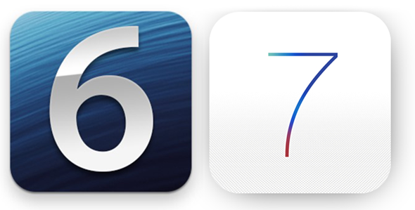
Although the small matter of E3 has dominated much of this week’s column inches, the world is also simultaneously distracted by Apple’s iOS 7 announcement, which has brought perhaps even more by way of change than most of us had anticipated. Visually, it’s as radical an overhaul as we’ve seen in mobile space, and naturally, many have been busily comparing new and old, with some still unsure as to whether iOS 7 appears better than iOS 6. We’ve already seen a faceoff between the app icons of the current and future versions, and now, a Twitter user under the handle ManzoPower has created a similar piece that looks at some of the navigation bars, tabs and toggles. Check it out after the leap!
One thing that is immediately apparent, is just how clean the various elements of iOS 7 look versus the current form. Skeuomorphism makes way for simple color configurations in every corner, and although the home screen is relatively bold and bright, the general in-app look is one of relative understatement.
In my humble opinion, the new pop-up notification alert is the biggest improvement, with a plain, white background making the reading of your important info a breeze. Steve Jobs, along with the now departed (from Apple) Scott Forstall, were both said to be strong advocates of the skeuo look, but although I can see how the saturated icons may be something of an eyesore to some, almost every element of every stock app looks considerably better in iOS 7 than any other generation of Apple’s iconic mobile OS.
This comparison image gives us a great idea how third-party apps will look once iOS 7 starts rolling out to everyone later this year.

As you can see, the tool and tab bars are as minimalistic as everything else, and despite the fact that some have sneered of iOS 7 looking like something designed for children, our affinity to minimal user interfaces here at Redmond Pie leaves us on the positive side of the fence as we head towards the next generation.
That’s us, though, but what do you think? Does the new look throughout iOS 7 make for an improved experience? Or did you prefer the appearance of iOS 6 and those before it? Please do, as ever, share you comments and thoughts below; it’s always great to hear from you guys!
(Source: Twitter)
You may also like to check out:
You can follow us on Twitter, add us to your circle on Google+ or like our Facebook page to keep yourself updated on all the latest from Microsoft, Google, Apple and the Web.
