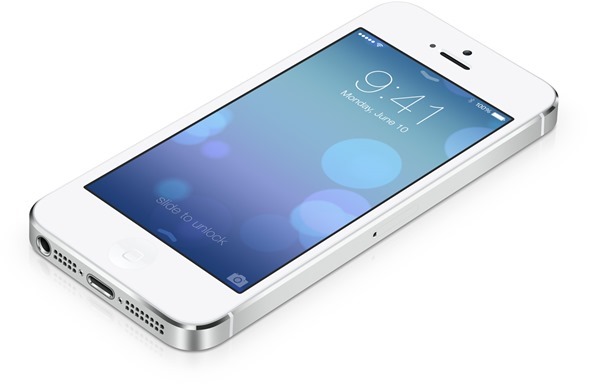
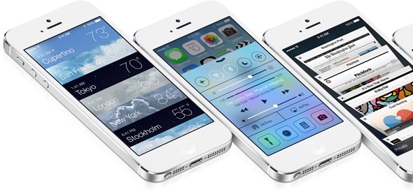
As has already been discussed in quite some detail over the past 24 or so hours since the WWDC announcement, iOS 7 has changed things in a big way. Essentially every facet of Apple’s mobile OS has been tweaked and altered, delivering a look scarcely recognizable from iOS 6. Through no aspect are the changes more apparent than in the new home screen icons, and to really offer some perspective as to just how much different the new icons are versus old, Twitter user @pawsupforu has delivered a comparative illustration.
As you will see below, each and every stock icon from iOS 7 has been placed alongside the corresponding icon from the preceding iOS 6. Not only is almost every little image a great deal brighter, but all of that omni-present skeuomorphic gloss has been rather unceremoniously dumped, and on top of that, nearly every icon has been given a redesign.

In terms of the actual designs, it’s unquestionable that Apple has done a good job. Every icon’s image represents a more contemporary look and feel, which is an ideal starting point when looking to pull a large user base into the next chapter.
The lack of skeuomorphism, allied to the increase in brightness (and contrast) leads us to believe that, after all, perhaps the glossy tiles weren’t so bad after all. The designs are slick, colors vibrant; but even when spaced out and placed on a plain background, those icons are just too darn bright. In my humble opinion, they’re a little too ‘in your face,’ and had Apple toned down the color saturation, I think those skeptical of the new icon design would be fewer and farther between.
![]()
With that said, the tech industry is famously incredulous when it comes to radical changes, but as Facebook has learned over the years, most tend to simply suck it up and get on with it. However, with an alternative like Android around offering customization right out of the box, it will be interesting to see whether those who’ve been quick to note of their distaste will still be queuing outside their local Apple Retail Store when iOS 7 makes its debut on a new device; presumably an iPhone 5S / 6 later this year.

What do you think of the new icons – are they forcing you into a squint? Or are tech fans simply getting a bit carried away?
(Source: Twitter)
You may also like to check out:
- iOS 7 For iPhone, iPad, iPod touch: Features, Compatibility, Release Date
- Download iOS 7 Beta 1 For iPhone 5, 4S, 4, iPod touch 5
You can follow us on Twitter, add us to your circle on Google+ or like our Facebook page to keep yourself updated on all the latest from Microsoft, Google, Apple and the Web.

