This article demonstrates how to create animations by using pure XAML with a code behind C# file instead of using tools like Expression Blend. This provides the developer the comforts to animate a particular object in any way he wants.
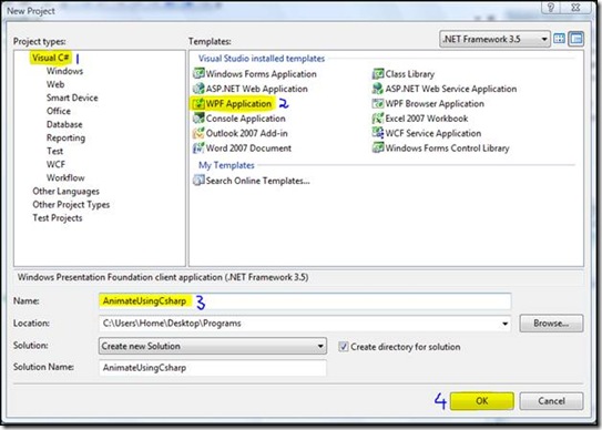
Create a new WPF application. Select language as C# and name the application to whatever you desire.
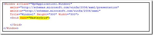
Secondly, give your grid any name like Name=”MasterGrid”
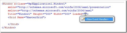
Now you need to define a windows "Loaded" event. On your XAML code pane, simply define a new event handler for Loaded event
Now go to your Window1.xaml.cs file
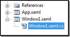
Here you can easily find Windows Loaded method ready to be defined.
Now the first thing that you need to create for dynamic controls is Resource Dictionary. Resource Dictionary holds all the styles you wish to have for your dynamic user controls. So to create the Resource Dictionary, you do the following:
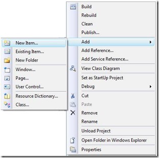
1- Right Click your project root and select Add->New Item…
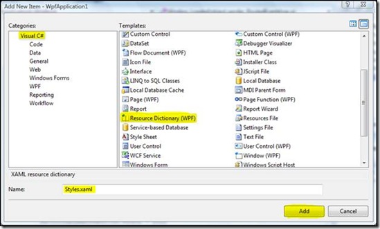
2- From the Items selection menu select Resource Dictionary (WPF), give it any name and click OK.
3- Now open your Resource Dictionary file.
The problem with editing a Resource Dictionary in Visual Studio 2008 is that one cannot see what’s the behavior of style is or what animations one is referring to, so unfortunately we are left here with no choice but to use Expression Blend, Create a style there and then copy paste its xaml code in our resource dictionary file.
Note: If you are a true Pro in xaml and can define your styles by writing pure xaml then you can go for it. There also exist another option which in my opinion is better than the two option I have discussed but I will keep the discussion of that option in Part 2 of this article.
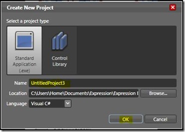
4- Create a New Project. Name it to whatever you like and then click OK.
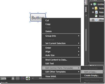
5- Now in this environment I am going to create a button with certain modifications and animations. So for that, I need to create a style therefore I first drop a button in my workspace and right click on it and select Edit Control Parts(Template)->Edit a Copy
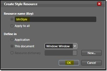
6- Provide a name to your new style and click ok. I named my style as btnStyle. (Leave every other option to its default settings)
7- Now you can create your button’s new style here and if you want you can also add animations to it. Without going into details here, I created a new style for my button. For your assistance the xaml code of my button is given below;
1: <Style x:Key="btnStyle" TargetType="{x:Type Button}">
2: <Setter Property="FocusVisualStyle" Value="{StaticResource ButtonFocusVisual}"/>
3: <Setter Property="Background" Value="{StaticResource ButtonNormalBackground}"/>
4: <Setter Property="BorderBrush" Value="{StaticResource ButtonNormalBorder}"/>
5: <Setter Property="BorderThickness" Value="1"/>
6: <Setter Property="Foreground" Value="{DynamicResource {x:Static
SystemColors.ControlTextBrushKey}}"/>
7: <Setter Property="HorizontalContentAlignment" Value="Center"/>
8: <Setter Property="VerticalContentAlignment" Value="Center"/>
9: <Setter Property="Padding" Value="1"/>
10: <Setter Property="Template">
11: <Setter.Value>
12: <ControlTemplate TargetType="{x:Type Button}">
13: <ControlTemplate.Resources>
14: <Storyboard x:Key="FormBtnMouseOver1">
15: <ColorAnimationUsingKeyFrames BeginTime="00:00:00" Storyboard
.TargetName="label" Storyboard.TargetProperty="(TextElement.Foreground)
.(Custom:SolidColorBrush.Color)">
16: <SplineColorKeyFrame KeyTime="00:00:00.1000000" Value="#FFB71000"/>
</ColorAnimationUsingKeyFrames>
17: </Storyboard>
18: <Storyboard x:Key="FormBtnMouseLeave1">
19: <ColorAnimationUsingKeyFrames BeginTime="00:00:00" Storyboard.TargetName="label"
Storyboard.TargetProperty="(TextElement.Foreground).(Custom:SolidColorBrush.Color)">
20: <SplineColorKeyFrame KeyTime="00:00:00.1000000" Value="#FF000000"/>
21: </ColorAnimationUsingKeyFrames>
22: </Storyboard>
23: </ControlTemplate.Resources>
24: <Grid x:Name="grid" Width="150" Height="26.58">
25: <Label RenderTransformOrigin="0.5,0.5" HorizontalAlignment="Left" Margin="0,0,0,0"
x:Name="label" VerticalAlignment="Top" Width="150" Height="36.48" Content="Bring
Mouse Over Me!" FontFamily="Calibri" FontSize="12">
26: <Label.RenderTransform>
27: <Custom:TransformGroup>
28: <Custom:ScaleTransform ScaleX="1" ScaleY="1"/>
29: <Custom:SkewTransform AngleX="0" AngleY="0"/>
30: <Custom:RotateTransform Angle="0"/>
31: <Custom:TranslateTransform X="0" Y="0"/>
32: </Custom:TransformGroup>
33: </Label.RenderTransform>
34: </Label>
35: </Grid>
36: <ControlTemplate.Triggers>
37: <EventTrigger RoutedEvent="Mouse.MouseEnter" SourceName="grid">
38: <BeginStoryboard Storyboard="{StaticResource FormBtnMouseOver1}"/>
39: </EventTrigger>
40: <EventTrigger RoutedEvent="Mouse.MouseLeave" SourceName="grid">
41: <BeginStoryboard x:Name="FormBtnMouseLeave1_BeginStoryboard" Storyboard=
"{StaticResource FormBtnMouseLeave1}"/>
42: </EventTrigger>
43: <Trigger Property="IsKeyboardFocused" Value="true"/>
44: <Trigger Property="ToggleButton.IsChecked" Value="true"/>
45: <Trigger Property="IsEnabled" Value="false">
46: <Setter Property="Foreground" Value="#ADADAD"/>
47: </Trigger>
48: </ControlTemplate.Triggers>
49: </ControlTemplate>
50: </Setter.Value>
51: </Setter>
52: </Style>
8- Next you need to take some default styles as well with you since we edit a copy of default button template. Which are
1: <Style x:Key="ButtonFocusVisual">
2: <Setter Property="Control.Template">
3: <Setter.Value>
4: <ControlTemplate>
5: <Rectangle SnapsToDevicePixels="true" Stroke="Black" StrokeDashArray="1 2"
StrokeThickness="1" Margin="2"/>
6: </ControlTemplate>
7: </Setter.Value>
8: </Setter>
9: </Style>
10:
11: <Custom:LinearGradientBrush x:Key="ButtonNormalBackground" EndPoint="0,1" StartPoint="0,0">
12: <Custom:GradientStop Color="#F3F3F3" Offset="0"/>
13: <Custom:GradientStop Color="#EBEBEB" Offset="0.5"/>
14: <Custom:GradientStop Color="#DDDDDD" Offset="0.5"/>
15: <Custom:GradientStop Color="#CDCDCD" Offset="1"/>
16: </Custom:LinearGradientBrush>
17:
18: <Custom:SolidColorBrush x:Key="ButtonNormalBorder" Color="#FF707070"/>
9- Style done, finally we need to copy paste the whole xaml code of your styles along with certain references and default styles. The code of your Resource Dictionary file Style.xaml is
1: <ResourceDictionary
2: xmlns="http://schemas.microsoft.com/winfx/2006/xaml/presentation"
3: xmlns:x="http://schemas.microsoft.com/winfx/2006/xaml"
4: xmlns:mc="http://schemas.openxmlformats.org/markup-compatibility/2006"
5: xmlns:Custom="http://schemas.microsoft.com/winfx/2006/xaml/composite-font"
6: xmlns:Microsoft_Windows_Themes="clr-namespace:Microsoft.Windows.Themes;assembly
=PresentationFramework.Aero">
7:
8: <Style x:Key="ButtonFocusVisual">
9: <Setter Property="Control.Template">
10: <Setter.Value>
11: <ControlTemplate>
12: <Rectangle SnapsToDevicePixels="true" Stroke="Black" StrokeDashArray="1 2"
StrokeThickness="1" Margin="2"/>
13: </ControlTemplate>
14: </Setter.Value>
15: </Setter>
16: </Style>
17:
18: <Custom:LinearGradientBrush x:Key="ButtonNormalBackground" EndPoint="0,1" StartPoint="0,0">
19: <Custom:GradientStop Color="#F3F3F3" Offset="0"/>
20: <Custom:GradientStop Color="#EBEBEB" Offset="0.5"/>
21: <Custom:GradientStop Color="#DDDDDD" Offset="0.5"/>
22: <Custom:GradientStop Color="#CDCDCD" Offset="1"/>
23: </Custom:LinearGradientBrush>
24:
25: <Custom:SolidColorBrush x:Key="ButtonNormalBorder" Color="#FF707070"/>
26:
27: <Style x:Key="btnStyle" TargetType="{x:Type Button}">
28: <Setter Property="FocusVisualStyle" Value="{StaticResource ButtonFocusVisual}"/>
29: <Setter Property="Background" Value="{StaticResource ButtonNormalBackground}"/>
30: <Setter Property="BorderBrush" Value="{StaticResource ButtonNormalBorder}"/>
31: <Setter Property="BorderThickness" Value="1"/>
32: <Setter Property="Foreground" Value="{DynamicResource {x:Static SystemColors
.ControlTextBrushKey}}"/>
33: <Setter Property="HorizontalContentAlignment" Value="Center"/>
34: <Setter Property="VerticalContentAlignment" Value="Center"/>
35: <Setter Property="Padding" Value="1"/>
36: <Setter Property="Template">
37: <Setter.Value>
38: <ControlTemplate TargetType="{x:Type Button}">
39: <ControlTemplate.Resources>
40: <Storyboard x:Key="FormBtnMouseOver1">
41: <ColorAnimationUsingKeyFrames BeginTime="00:00:00" Storyboard.TargetName="label"
Storyboard.TargetProperty="(TextElement.Foreground).(Custom:SolidColorBrush.Color)">
42: <SplineColorKeyFrame KeyTime="00:00:00.1000000" Value="#FFB71000"/>
43: </ColorAnimationUsingKeyFrames>
44: </Storyboard>
45: <Storyboard x:Key="FormBtnMouseLeave1">
46: <ColorAnimationUsingKeyFrames BeginTime="00:00:00" Storyboard.TargetName="label"
Storyboard.TargetProperty="(TextElement.Foreground).(Custom:SolidColorBrush.Color)">
47: <SplineColorKeyFrame KeyTime="00:00:00.1000000" Value="#FF000000"/>
48: </ColorAnimationUsingKeyFrames>
49: </Storyboard>
50: </ControlTemplate.Resources>
51: <Grid x:Name="grid" Width="150" Height="26.58">
52: <Label RenderTransformOrigin="0.5,0.5" HorizontalAlignment="Left" Margin="0,0,0,0"
x:Name="label" VerticalAlignment="Top" Width="150" Height="36.48" Content="Bring
Mouse Over Me!" FontFamily="Calibri" FontSize="12">
53: <Label.RenderTransform>
54: <Custom:TransformGroup>
55: <Custom:ScaleTransform ScaleX="1" ScaleY="1"/>
56: <Custom:SkewTransform AngleX="0" AngleY="0"/>
57: <Custom:RotateTransform Angle="0"/>
58: <Custom:TranslateTransform X="0" Y="0"/>
59: </Custom:TransformGroup>
60: </Label.RenderTransform>
61: </Label>
62: </Grid>
63: <ControlTemplate.Triggers>
64: <EventTrigger RoutedEvent="Mouse.MouseEnter" SourceName="grid">
65: <BeginStoryboard Storyboard="{StaticResource FormBtnMouseOver1}"/>
66: </EventTrigger>
67: <EventTrigger RoutedEvent="Mouse.MouseLeave" SourceName="grid">
68: <BeginStoryboard x:Name="FormBtnMouseLeave1_BeginStoryboard" Storyboard=
"{StaticResource FormBtnMouseLeave1}"/>
69: </EventTrigger>
70: <Trigger Property="IsKeyboardFocused" Value="true"/>
71: <Trigger Property="ToggleButton.IsChecked" Value="true"/>
72: <Trigger Property="IsEnabled" Value="false">
73: <Setter Property="Foreground" Value="#ADADAD"/>
74: </Trigger>
75: </ControlTemplate.Triggers>
76: </ControlTemplate>
77: </Setter.Value>
78: </Setter>
79: </Style>
80: </ResourceDictionary>
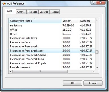
10- Note that there is an external reference required at line no.6 of this xaml code named PresentationFramework.Aero for this reference you need to right click your project file in solution explorer and select Add Reference… and select .NET->PresentationFramework.Aero
This is all we need to do in xaml and our resource dictionary file.
11- Now we go back to our Window1.xaml.cs file and create a global Button instance.
1: Button btn = new Button();
12- Exchange the code of Window_Loaded with the code below
1: private void Window_Loaded(object sender, RoutedEventArgs e)
2: {
3: btn.Click += btn_Click;
4: btn.Height = 30;
5: btn.Content = "Click Me!!";
6: btn.Width = 200;
7:
8: MasterGrid.Children.Add(btn);
9: }
In the code above, we simply defined some properties of our global button.
13- Add a clicking event using
btn.Click += btn_Click;
in windows loaded event we now need to define btn_Click, which will be
1: private void btn_Click(object sender, RoutedEventArgs e)
2: {
3: ResourceDictionary res = (ResourceDictionary)Application
.LoadComponent(new Uri("Style.xaml", UriKind.Relative));
4: Style style = (Style)res["btnStyle"];
5: btn.Style = style;
6: }
Here we created a reference to our resource dictionary file, then created a new style instance and provided it our Resource Dictionary of style "btnStyle" which we created earlier in Expression Blend and then finally defined a new style to our button.
Download Source Code: That’s it! Enjoy working with WPF applications and stay connected for Part 2. Happy coding!! 🙂