With Avengers: Infinity War now the big news across Hollywood, there is plenty to learn about the way the Marvel movies are made and no matter what the secret sauce is, it’s clear it’s working.
This stretches all the way back to 2008’s Iron Man release, and we have today learned what the inspiration was for Iron Man’s HUD. As it turns out, it was Apple’s iPhone.
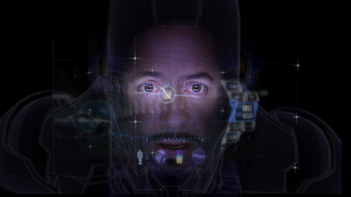
The folks over at vfxblog reported the details on Iron Man’s original HUD with information coming from visual effects and HUD supervisors. According to the report, Jon Favreau wanted Iron Man’s own HUD to mimic the look and feel of the original iPhone.
Kent Seki, visualisation/HUD effects supervisor from Pixel Liberation Front said that even though there was more to the final HUD design than just copying the iPhone, it was Apple’s smartphone that was the core for everything we saw on-screen.
There were many rules and driving philosophies we established along the way that led us to the final product. I remember in an early discussion in post-production with Jon Favreau. He pulled out his iPhone, which was a new thing at the time. He said, ‘I don’t want to tell you a specific graphic to make for the HUD, but I want it to feel intuitive like my iPhone.’
Dav Rauch, HUD design supervisor of The Orphanage provided a little more context by highlighting that the original iPhone had arrived just before a meeting with Favreau during which the pair “geeked out” on the new smartphones they had both picked up with the user interface being key to their interests. This, ultimately, informed Iron Man’s own interface.
The iPhone had just come out like literally a week or two before the meeting with Jon – and I got an iPhone and Favreau had gotten an iPhone. When I was down there we kind of geeked out on our iPhones, and we were talking about what we liked about the iPhone because he was really inspired by it. He was like, ‘What I love about this thing is it just kind of does what it should do, and it kind of does what I want it to do and it’s very intuitive and it’s very simple.’ We opened it up and I was looking at the transitions in an iPhone. I’m like, ‘These transitions are so simple and they’re just like zooming transitions, or wipe transitions. There’s nothing fancy about this phone, but what’s fancy about this phone is that it works and it works really well.’
So there we have it. Not only was Jony Ive designing smartphones back in 2008, but he was designing superheroes, too.
(Source: vfxblog )
You may also like to check out:
- iOS 11.3.1 Jailbreak: iOS 11.3 Exploit POC By Ian Beer Has Been Released
- Download: iOS 11.4 Beta 3 IPSW, OTA Seeded For Testing
- Fortnite 4.0 Season 4 With Patch Notes Released, Here’s What Is New
- Force Upgrade Windows 10 April 2018 Update Manually, Here’s How
- Download Windows 10 April 2018 Update 1803 ISO
- Jailbreak iOS 11.3 / 11.3.1 / 11.2.6 On iPhone And iPad [Status Update]
- Download iOS 11.3.1 IPSW Links, OTA Update With Fix For Third-Party Screen Repair Issue
You can follow us on Twitter, add us to your circle on Google+ or like our Facebook page to keep yourself updated on all the latest from Microsoft, Google, Apple and the Web.
