After months of testing, leaks and mass panic, Apple’s iOS 7 is here. Of course, it’s been available as an under the radar update for anyone who’s been brave enough to look for it, but now it’s legit.
Apple is rightly proud of the fact that its iPhone and iPad users download new software updates quicker than the competition. Within months, it will be a realistic option for developers to drop support for prior versions of iOS, should they so wish, because a ridiculously high percentage of users will have updated to iOS 7. We Apple users like our software updates, especially when they’re free.

But once the updates are downloaded, and once the apps have caught up too, and all the dust has settled, will everyone still be happy? Will iOS 7 be seen as a smash hit or a damp squib? Even worse, will it be deemed as Apple’s biggest misstep since Antennagate just a few short years ago?
There’s no real way of answering that for another week or so, but our gut feeling is that people will like what they see when they get iOS 7 on their iPads or iPhones. It’ll just need to settle down a bit, that’s all.
After all, Apple needed to do something with its aging iOS. Few can argue that it wasn’t starting to show its age. In an industry where Google’s Android is starting to really flesh out into a fast, modern mobile operating system, and where Windows Phone is arguably leading the way in interface design, the five year old iOS was getting a little long in the tooth.
Largely untouched since the original iPhone made its debut back in 2007, we’ve had six big iterations of iOS already, before version 7 dropped earlier today. I’ve been using iOS 7 on my main iPhone – an iPhone 5 – since iOS 7 beta 1 landed. I’ve been posting about my experiences as the weeks and months have rolled on, and I’m pleased with how things have worked out. Mostly.

With all that said, I’ve been tasked here at Redmond Pie to write a review of iOS 7 as I’ve lived with it 24 hours a day, 7 days a week since WWDC (June) earlier this year. In fact, I can barely remember what iOS looked like pre-iOS 7. And that’s just a bit weird.
So, the ambling introduction over, let’s get into what makes iOS 7 tick. I’ll keep things nice and separate so as to make this as readable as possible, whilst also trying to make the whole process easier for me. I am getting on a bit now, after all!
So, let’s get started.
What’s new on the surface?
Redesign
For all the new APIs, all the new under the hood tweaks that iOS 7 packs in, it’s the very bright-colored interface that everyone will notice. That’s the case for any big update, but it goes doubly so for iOS 7.
As anyone who has seen a screenshot of iOS 7 will be able to tell, this isn’t the iOS you’ve been using for the last few years. Yet, somehow, it feels familiar. Gone are the faux-3D buttons and graphical elements in favor of a much more flat, less ‘bumpy’ interface that has more than a little of the Windows Phone Metro / Modern look about it. And that’s a good thing.
With iOS 7, the changes to the interface that we all spend so much time looking at makes the entire experience feel more alive, more fluid. And that doesn’t come from the things you look at as such, but rather how those elements move around the screen.
Let’s take the multitasking interface as an example. In previous versions of iOS, double-pressing the Home button would see a line of icons appear at the bottom of the screen. They slide into view in a similar way to how Folders slide open. It’s all very 2D.
With iOS 7, all that’s gone. Now, pressing that Home button twice sees the current app fade backwards into a row of screenshots showing all the apps that are running. Tapping one sees that ‘card’ for want of a better word, fly to the foreground and take focus. It’s very 3D, and makes the entire experience feel like the phone has depth. For something that everyone says is flat, iOS can actually be quite the opposite.
Those folders I mentioned earlier. In iOS 7, they open with a zoom, filling the screen instead of sliding everything around. Again, you’re left with a sense of depth that suggests iOS is actually running on various layers. That carries over to the way both Notification Center and Control Center flick down and up respectively, sitting atop the content that is now actually beneath them. A blurring effect means that content is always semi-visible, again adding to the feeling of depth that just wasn’t there in previous releases of Apple’s mobile operating system.

iOS 7 Folders
There’s the font, too, though that will be either a good or bad thing depending on which side of the fence you sit. Personally, I’m a fan of Apple’s choice here, even if it did take it a couple of tries before it settled on the particular brand of Helvetica that iOS 7 uses today. Again, it feels more modern, more real than what came before.
Frankly, these changes are something we’d also like to see in Mac OS X, but let’s not get ahead of ourselves too much.
Home Screen
It’s not all good news though. The icons on the Home Screen aren’t great, but the best thing I can say about some of them is that I hate them less now than I did when my iPhone restarted the first time I installed the initial beta back in June. And that’s a good thing, really.
As I mentioned above, iOS 7 has a sense of depth to it, and can be felt in many places as you start to use your device with iOS 7 on it. if you can recall Apple’s WWDC keynote, then there’s no way you missed Parallax.
")
What does Parallax do? In short, it gives the user an illusion that the space between the app icons and the wallpaper is hollow. When you unlock your device, and tilt it in different directions, you’ll feel that the wallpaper is tracking your movement and changes it’s position accordingly (think 3D). The magic actually happens all thanks to the device’s gyroscope and accelerometer working together, therefore it’s not really rocket science. But still, it’s a fun feature to use, and a real battery destroyer.
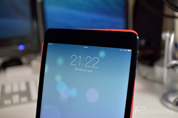
Lock Screen
One of the first thing people may notice about the switch to iOS 7 is the new lock screen. Featuring handles for pulling the Notification Center down or Control Center up, the redesign also removes the iconic ‘Slide to Unlock’ area. Now, the same gesture can be performed anywhere on the screen and the phone will unlock, which doesn’t sound like a big change at first, but I still find myself swiping an imaginary unlock switch each and every time.

Multitasking
Multitasking has been something of a bug bear with iOS since the early days. First off, it didn’t do it unless you were using one of Apple’s own apps. Which was bad.
Then starting with iOS 4 it did it, which was good. Apart from it didn’t do it properly, which some said was actually better than real multitasking. Whether it was or not, it meant that developers couldn’t do some of the things that their Android-toting brethren could, like proper background updates.
With iOS 7, that’s changing with a brand new UI. Not entirely though – don’t expect to have a hundred and one apps running all the time like Android. This is still iOS after all.
")

Now though, iOS 7 will learn when you use your apps and allow them to update in the background so that they’re good to go when you are. Check your news app at 9am every morning, or at 10pm before bed? Now, iOS devices will learn that behavior and start allowing your news apps to update their content so that when you tap its icon, everything’s ready and waiting for you.
Apple is also adding the ability for push notifications to initiate a background sync. Until now, apps like Gmail could send you a push notification saying that you’ve received a new email, but when you launch the app it’s not there. You’re left waiting for the app to connected to the required servers and then for it to download the new content. With iOS 7, that app will be able to do that sync as soon as the notification is received.
But wait, there’s more!
There are other fancy things going on behind the scenes, too. Now, iOS 7 will do opportunistic updates, so when you unlock your device to do something the OS will take advantage of the fact that it has had to spin up your device’s CPU already, so will do some updating while the going’s good.
Coalesced updates mean that iOS 7 will recognize when an app is using a particular radio, for instance, and allow another app to piggyback off that, effectively getting two updates done for the price of one. It’s all about multitasking without the usual hit on battery life, and Apple seems to have been working very hard on finding ways to do just that while still offering a real multitasking experience.
We won’t know how good a job they’ve done of it until apps start to take advantage of those new APIs, but we can’t wait to open our Twitter client and have the latest replies sat waiting for us, or have our RSS client update so that we don’t have to wait each time we launch it. Then there’s the Gmail app that should now be able to download emails when they arrive. Exciting stuff!
Notification Center
Another relatively recent addition to iOS, Notification Center has also received a makeover. Now consisting of a three pane approach, gone are the widgets in favor of a more clean and arguably less extensible approach. Not that Apple ever let third party developers create their own widgets anyway.
The first pane plays host to a Google Now-like page of information. Thanks to Apple Maps, iOS 7 now knows where you live and, probably, where you work. Based on that it will offer up information on how long it will take you to commute between the two, just like Google Now. It’ll take traffic into consideration too.

This first pane is also where weather notifications now live, as do your calendar events. Everything is presented in a way that makes us think of Siri, and feels much more natural than having everything split into sections like the old Notification Center. More natural language is used too, so everything feels like it’s an assistant gathering the information rather than a few apps spewing out stats. I like it, but I’d like it to do more, too. Maybe in iOS 7.1?
The second pane is more like the old Notification Center. A swipe to the left – did we mention you can swipe? – brings up all your notifications, separated into lists based on the app that generated them. Tapping one causes the required app to launch. It’s Notification Center as you know it, really.

The third pane is pretty much the same story, but here you’ll find missed notifications, which is actually a bad name for what seems to be an area where notifications from the last 24 hours are shown unless dismissed. The difference between this pane and the general notifications one is that they will stay there until dismissed, instead of clearing after 24 hours.
At least, that’s how I think it works. In all honesty it’s rare I venture that far over, and I still don’t really understand why that third pane exists. I may be proven wrong when everyone else gets their hands on iOS 7 though, and if you can actually tell me what use it is, let me know!
The real shame about Notification Center is that it still doesn’t allow quick replying to emails or messages without launching the app. It’s something jailbreakers have been able to do for so long that it’s almost unforgiveable that Apple hasn’t caught on. Android allows users to act on notifications in different ways depending on the app they relate to, and iOS doesn’t even allow that yet. With so many changes going on with iOS 7, it may just be another update away. It may not though, and that’s a crying shame indeed.
Control Center
Oh Control Center, how we’ve been crying out for you for so long. Finally, after all this time we now have quick access to things like Airplane Mode, turning Wi-Fi on and off and flicking the switch on Bluetooth. There are music controls, too, as well as buttons that launch things like the Clock app, the Calculator app and a flashlight. You’ll find quick access to the Camera app alongside that lot, too.

Being able to invoke Do Not Disturb or switch the rotation lock on without delving into the Settings app is revelation at times, and the fact that it can be flicked up from the bottom of the screen like some sort of inverted Notification Center anywhere in the OS is a bonus. Being able to do it from the lock screen just makes it even better.
Still, it’s not perfect. I’d like to be able to choose which options can be toggled, or add my own apps and replace that Calculator option. Still, we can’t have everything now, can we?
AirDrop
One of the things you’ll find in Control Center is AirDrop. If you’ve missed being able to send photos over Bluetooth like you used to in the pre-iPhone days, then you’re going to love AirDrop. Assuming all your friends have iPhones, that is.

Using a clever mix of peer-to-peer Wi-Fi and Bluetooth, AirDrop allows the sharing of images and files over the airwaves. Using it is as simple as tapping the usual share button that apps can use, and alongside the option to email the file in question, or perhaps open it in a different app, you’ll now find an AirDrop button. Assuming your friends have the option turned on, they’ll show up on your iPhone, eagerly awaiting whatever it is you’ve deemed worthy of them receiving. It’ll come in really useful for many people, but I’m so accustomed to emailing everything after years of iOS use that I keep forgetting it exists. That will hopefully change once everyone is running iOS 7 as well, but the fact that it can’t talk to AirDrop on the Mac is a shame to say the least.
On the few occasions I’ve actually used AirDrop, it’s worked just as well as I could expect. Functional is the best way to describe it, I think.
Hopefully that’s an oversight that will be rectified at some point in the future.
Siri
I almost forgot about Siri, so that should give you some sort of indication as to how much use it gets from me. Still, it’s there so let’s take a look at what’s new.
As with all iOS 7’s first-party apps, Siri has received a new interface that looks very similar to that of Notification Center. The personal assistant also now pulls data in from new sources such as Twitter, Bing and Wikipedia, while offering data in new and interesting ways. You can now ask Siri to search for photos of things and have the results show as a collection of thumbnails, for example.

I wouldn’t say that any of the changes to Siri are going to make people use it if they don’t already, but any improvement is a good improvement. Apple doesn’t seem to be pursuing Siri as much as it once was, and while it is now no longer designated as a beta app, I still find it hard to get too excited about it.
If you’re a big Siri user though, you’ll at least appreciate the new interface.
Safari
The default iOS Web browser, Safari is what the vast majority of iPhone and iPad users will be reading their websites on and that isn’t going to change in iOS 7. While I prefer to do my animated gif watching in Chrome, it’s always good to see Safari get some love here and there, and this year is no exception.
Receiving the now obligatory iOS 7 lick of paint, Safari now removes all the chrome that previously took up so much of the screen. Now, content is very much front and center with the interface disappearing when it isn’t needed.
The separate search bar is now gone, too, with Apple instead opting for a unified address and search bar that not only makes the app look nicer, but also means I won’t keep tapping the wrong one. Win!

Switching between windows is also now just a case of a swiping left or right if you so choose, and the new interface for seeing previews of those windows, or tabs if you prefer, now comes in the form of a vertical carrousel affair.
The entire app feels faster, and Web pages render just as they should. I’d have to say that Safari is still the best mobile browser on the planet, and I only use Chrome thanks to all its account syncing loveliness. Safari in iOS 7 just keeps the ball rolling.
World’s First 64-bit Mobile OS
Here’s something which would spark interest in the geek inside you: iOS 7 is the first ever 64-bit mobile OS. So what does that really mean? Well, if you’re an average user, then it literally means nothing at this point. But if you’re a developer or a pro user, then iOS 7 can take full advantage of the hardware architecture that lies inside your device, providing you raw muscle power to boost performance.
Keep one thing in mind though, iOS 7 might be a 64-bit OS, but of course you need 64-bit hardware for software to act like it’s 64-bit. As of now, the only iOS device which boasts a 64-bit processor is the iPhone 5s. And of course, we can’t test all those 64-bit enhancement claims since we don’t have an iPhone 5s with us right now.
But still, it’s there, and Apple’s mobile OS looks future proof.
iTunes Radio and Music
Hot on the heels of the ridiculously bad Ping, Apple is once again trying to launch something new in the music space. After years of success with the iTunes Music Store, Apple is now trying its hand at the streaming radio game.
Rumored for what felt like forever, Apple’s iTunes Radio was expected to be a play for the market that Spotify is currently dominating, but in effect it’s not a great deal more than customizable radio stations that make it easier for you to buy the songs that you like. Oh, and it’s only available in the United States. Awesome. There’s a work around to access it out U.S. though: How To Enable iTunes Radio In iOS 7 Outside US [VIDEO]

Announced alongside iOS 7, iTunes Radio seems to have been almost immediately forgotten by the majority of the people who have been testing Apple’s latest mobile operating system. Apple may not have another Ping situation on its hands, but as things stand it’s safe to say that iTunes Radio is uninspiring at best, and wildly off the mark at worst.
So yeah, that’s iTunes Radio.
The Music app is pretty much standard affair. Apart from cosmetic changes, there’s really nothing new. The feature set has barely changed, and it’s good at what we’ve known the Music app has been good for a long time… playing music.
Camera and Photos
The Camera app has been given a very welcoming facelift, too. It’s now way more easier to navigate, controls are front and center, and switching between different camera modes is as easy as flicking on the viewfinder. Apple has definitely done its magic in this department.

The thing which really got us interested here are the live filters. Up to 8 filters to choose from, and with the ability to give your photos a retro look without much fuss and humiliation of downloading multiple apps, it’s safe to say that this department has been well covered.

If you’ve been using iOS since the beginning, you can easily recall how boring – or bad – the Photos app is. Apart from offering the user some features close to nothing, it’s really no more than a simple photo viewer. In iOS 7, Apple is taking things a bit further. And now offers more features and options to users, such as grouping photos according to year, month, location etc.
The new Camera and Photos apps work like a charm and should appease those who are really into photography and video recording.
iTunes Store and App Store
We knew this was coming when iOS 7 first got its mention at WWDC this year. And it’s safe to say that Apple has been putting a lot of resources into making its famed App Stores as much convenient and less horrendous to use as possible. But the question is; have they succeeded in doing so? They have.

The new iTunes Store and App Store carries the same design language as the rest of the OS, and looks as flat as you can imagine, which is actually a good thing. It allows users to focus more on the content they’re looking for, rather than being deviated with that awful gray background.
Find My iPhone (part of iCloud for iOS 7)
Find my iPhone? Yes! Find my iPhone in iOS 7 deserves a little light when it comes to protecting your device. First of all, it does exactly what you think it does… it finds your iPhone / iPad. But in iOS 7, it does a little more.
Starting from iOS 7, if you’ve enabled Find my iPhone, and have lost your device, then the device is of no use to the person who finds it, except the owner itself.
You can remotely wipe your device, which is all well and good. But the restore process will require the user to enter their Apple ID password. Yup, that renders the device useless to the next person who finds it. Great stuff.
iOS 7 on iPad
There’s more to iOS 7 than the iPhone of course, because this update is also available for the iPad. While still basically the same operating system, the iPad version does seem to be noticeably less stable though, which is hopefully just a case of Apple getting an update out to fix.
The new interface brought by iOS 7 does benefit from the extra screen real estate, too, with perhaps the best device to use it on being the iPad mini. Give that thing a Retina screen in its expected October update, and iOS 7 will just look even better.
Redmond Pie’s Tom Richardson demoing iOS 7 (beta 2) for iPad and iPad mini [June 2013]
Others
Other changes that don’t quite get the pulse racing but worth a mention include a new, darker keyboard, the ability to make Audio-only FaceTime calls in case you don’t want to see whoever you’re talking to and a new Messages app that shows timestamps when you perform a little swipe-to-left gesture.
There are of course countless other changes here and there, but part of the fun is finding them so we won’t spoil everything for you here!
Wrap-up
Redmond Pie’s Tom Richardson demoing iOS 7 features walkthrough [Beta 1 – June 2013]
Redmond Pie’s Tom Richardson going hands-on with iOS 7 final version [September 2013]
So that’s iOS 7. Beyond the likes of iTunes Radio and some odd additions to things like Notification Center, I have to admit I rather like it. Initial impressions were far from good, but as I got used to the new icons and Apple reduced the transition times as the betas rolled on, I’ve grown to be rather fond of what Apple is trying to do here.
More importantly, it had to do it. With iOS starting to creak a little, change was very much needed. With iOS 7, Apple’s certainly changed things. Those changes aren’t all for the better, no, but give it a few days and I feel sure you won’t want to go back to iOS 6.
And you just wait for all your apps to get updated for it, too. Then you’ll really like it!
Overall, it has to be said that this update changes the way your device feels without ruining it. This is still the iOS you know, just brighter, quicker and nicer to use.
A big thumbs-up from me.
RP Rating: 8.5/10
You may also like to check out:
- Download iOS 7 Final IPSW For iPhone 5, 4s, 4, iPad And iPod touch [Direct Links]
- iOS 7 Download: How To Install iOS 7 The Right Way [Video Tutorial]
You can follow us on Twitter, add us to your circle on Google+ or like our Facebook page to keep yourself updated on all the latest from Microsoft, Google, Apple and the web.
