The ever-popular streaming video service Netflix has today has today announced a range of redesigns across its TV-based apps, including the Apple TV and other set-top boxes.
The redesigned interface is supposed to make it easier to find the content you are looking for throughout Netflix, according to the company.
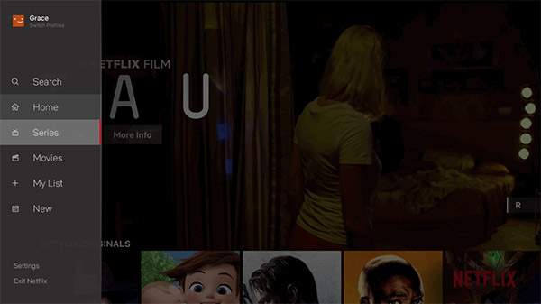
While the various rows of content continue to be the main focus in the redesigned apps, users will notice a new sidebar on the left side of their screens where Search, Home, Series, Movies, My List, and New entries live. The theory here is that it will make it easier for users to jump from one type of content, namely movies or TV shows, to another without having to go on a vertical scrolling mystery tour in the process.
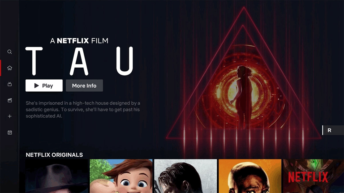
Beyond this, the overall experience of using the Netflix app remains the same, including the hugely irritating auto-playing previews.
While this may feel like an obvious update to some, validating that this TV experience was better for our members took extensive research, testing and technology improvements. Along those lines, we will continuously learn from our members and evolve the TV experience so that it gets even more simple, fun and easy to find the stories that make Netflix great.
In our testing of this new interface, we saw that that this simpler design helped members find something great to watch.
While Netlix has not confirmed which individual devices will receive this update, the “TV experience” devices it mentions usually covers anything from smart TVs to game consoles and everything in between. The roll-out has already begun, so if you’re a Netflix user, it’s likely you either already have the new interface or it is winging its way to you as you read this.
You may also like to check out:
- Jailbreak iOS 11.4 Beta 3 On iPhone X, 8, 7 Using Electra, Here’s How [Guide]
- Downgrade To iOS 11.4 Beta 3, 2, 1 IPSW Download And Jailbreak Using Electra Now Possible
- Jailbreak iOS 11.4.1 On iPhone X By Downgrading To iOS 11.4 Beta 3, Here’s How
- Download iOS 11.4.1 Final IPSW Links, OTA Update For iPhone And iPad
- Download iOS 12 Beta 4 IPSW Links, OTA Update For iPhone And iPad [Devs Only]
- Download iOS 12 Beta 4 Configuration Profile File Without Developer Account
- Download iOS 12 Beta 4 IPSW Links & Install On iPhone X, 8, 7, Plus, 6s, 6, SE, 5s, iPad, iPod [Tutorial]
You can follow us on Twitter, add us to your circle on Google+ or like our Facebook page to keep yourself updated on all the latest from Microsoft, Google, Apple and the Web.
