They say that you can tell a lot about a company and its culture by the way it continues to operate when the original founders have left and moved on to new pastures. If the rest of the workforce continues to operate in the same way, with the same morals, and the same underlying beliefs, then you know that the culture is there to stay and has been installed in the business. However, if things slowly change, and focus isn’t applied at the same levels and places it once was, then there could be an identity issue.
Apple has always been known for its commitment to detail and sweating to details so to speak, but designer and typography enthusiast Ryan Lau seems to think that could have changed after pulling apart the iOS 11 GM/final build.

Apple initially released the iOS 11 GM to developers on the back of its September 12 media event where iPhone 8 and iPhone X were introduced to the world. That GM is the same build number which was ultimately distributed around the world yesterday by Apple to be installed on iPhones and iPads globally. Even though it has been through a record number of pre-release seeds, Lau believes, and shows us that Apple has been lax in certain areas, allowing what he calls an “unfinished feeling” to creep into the platform famous for its design consistencies.
The unfinished feeling in iOS 11 mostly comes from UI and animation. UI elements in iOS are quite inconsistent, mixing a variety of UI elements, which might look quite similar but introduce a disconnected feeling for UX. The inconsistency of those elements majorly stems from those UI element updated in iOS 11, such as Large Title and new Search Bar. In my opinion, those newly introduced elements, which might be unfamiliar and new even to Apple engineers, have caused many inconsistent UI experience in iOS 11.
It seems that Lau’s main issues with iOS 11 stem from the fact that Apple’s own team doesn’t appear to be following the design guidelines that they layout and expects third-party designers and developers to follow.

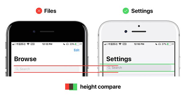
The designer highlights multiple instances of padding between titles and UI elements being inconsistent, as well as user-interface issues with search bars butted up against other UI elements without any spacing. There are also multiple instances of the same UI element, such as a Search Bar, being varied in height throughout Apple’s own native apps, such as Files and Settings.
After seeing all these inconsistencies in iOS 11 design, one wonders where has all the attention to detail gone which was once the forte and the DNA of the Cupertino-based company?
Have you noticed any of these issues yourself? Do you think this is a case of Apple’s losing focus on its core objectives of sweating over details which Steve Jobs was famous for? Or is it more of a case that iOS 11 is a huge improvement and a few things have flown under the radar? Sound off in the comments below.
You can check out the complete design analysis of iOS 11 by Lau here.
You may also like to check out:
- Fix iOS 11 iMessage, FaceTime, Handoff Activation Issues, Here’s How
- Fix For iOS 11 Cannot Send Mail Error In Outlook, Exchange, Office 365 Issue Coming In iOS 11.0.1
- Speed Up Or Fix iOS 11 Lag On iPhone, iPad, iPod touch [Tips]
- Fix Bad iOS 11 Battery Life Drain Percentage Issue, Here’s How [Guide]
- How To Downgrade iOS 11 To iOS 10.3.3 / iOS 10 [Tutorial]
- iOS 11 Download Final IPSW Links And OTA Update Released
- Download iOS 11, 11.0.1 Links & Install On iPhone 7, 7 Plus, 6s, 6, SE, 5s, iPad, iPod [Tutorial]
- Jailbreak iOS 11 On iPhone And iPad [Status Update]
You can follow us on Twitter, add us to your circle on Google+ or like our Facebook page to keep yourself updated on all the latest from Microsoft, Google, Apple and the Web.
