If you’re a big fan of the Mac, then you will already be well aware that the Aqua GUI first made an appearance in March of 2000 when Mac OS X 10.0 shipped. In the eighteen years following its appearance, it’s fair to say that Aqua has undergone more than a few changes, bringing us all the way up to 2018’s macOS Mojave release, expected to take place next month.
Something we all like to do after that kind of time is to reminisce about how things used to be and, often, note just how things have improved. If you’re a macOS fan, you can do exactly that thanks to a new Aqua screenshot library put together by 512 Pixels‘ Stephen Hackett.

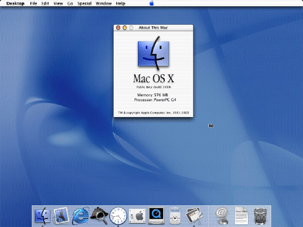
The collection of images, spanning gigabytes of screenshots, takes us on a magical mystery tour throughout the history of the Aqua GUI, starting back with Mac OS X 10.o, known as Cheetah. It’s amazing to see how things have changed in the past 18 years, and if you were not using a Mac back in 2000, then this will be a real treat.
Of course, there have been highs and lows. Pin stripes and Brushed Metal and Linen and Rich Corinthian Leather. Transparency and Vibrancy. At times, Apple had led the way into new design trends, and at other times, they have fallen behind the rest of the industry.
Aqua started life on CRTs and small notebook screens. Today, it spans from 12-inch MacBooks to the 27-inch iMac. It has undergone system font changes and the Retina transition. It has had to adapt, hosting the addition of dozens and dozens of features over the years.
Whether you are a Mac user or not, it’s always great to see how user interfaces have progressed over the years, and why Mac OS X 10.0 was still clearly the Mac we know and, mostly, love today.
(Source: 512 Pixels)
You may also like to check out:
- Download iOS 12 Beta 11 IPSW Links And OTA Update For Devs
- Jailbreak iOS 11.4.1 / 11.3.1: iOS 12 Beta 9 SEP Is Compatible With Electra Jailbreak Supported Firmware
- Download: Android 9 Pie Factory Images, OTA For Pixel, Essential Phone Released
- Download iOS 11.4.1 Final IPSW Links, OTA Update For iPhone And iPad
- Download iOS 12 Beta 11 Configuration Profile File Without Developer Account
- Download iOS 12 Beta 11 IPSW Links & Install On iPhone X, 8, 7, Plus, 6s, 6, SE, 5s, iPad, iPod [Tutorial]
You can follow us on Twitter, add us to your circle on Google+ or like our Facebook page to keep yourself updated on all the latest from Microsoft, Google, Apple and the Web.
