At this year’s Worldwide Developer Conference, Apple delivered quite a few surprises with regards to OS X 10.10 Yosemite, but one feature we had been almost certain of many months prior to WWDC was that of the appearance. We knew, given the significant alterations made with iOS 7, that the Cupertino’s thirst for uniformity would spill over to the Mac, and so it proved with the showcasing of a decidedly flattened-out Yosemite. Even though, as ever with such drastic visual changes, it’s probably going to take some developers weeks – even months – to update their apps in compliance with the new look, some eager folk have already been trying to imagine what the icons of some stock and third-party apps may look like when given the Yosemite treatment.
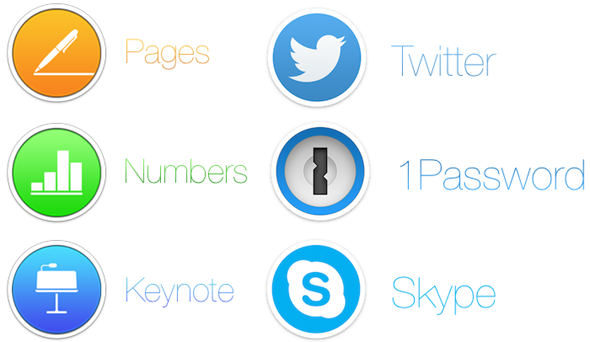
The forum users over at MacRumors are clearly excited about the new look for Yosemite, and as such, have been dreaming up icons for apps like Twitter, 1Password and Skype as well as Apple’s own utilities such as Keynote, Numbers and Pages.
As you can see, everything’s a lot flatter than we’ve become accustomed to with the OS X Dock, and although these designs aren’t necessarily indicative of what we’ll actually be getting as Yosemite begins to roll out to the consumer this fall, they still offer a rough idea of the new aesthetics.
When iOS 7 first came about, there was quite a bit of opposition, with many disgruntled users suggesting that the new look devalued the overall feel of the OS. However, the initial fanfare soon died down as those against the changes came around to the idea, and as such, Yosemite’s new look scarcely garnered a single negative comment.
These new icon designs are pretty neat in a lot of ways imaginable, and given that we’re in favor of Yosemite’s look here at Redmond Pie, we do hope that what we’re seeing here is a teaser of the real deal.
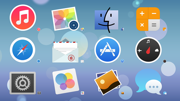
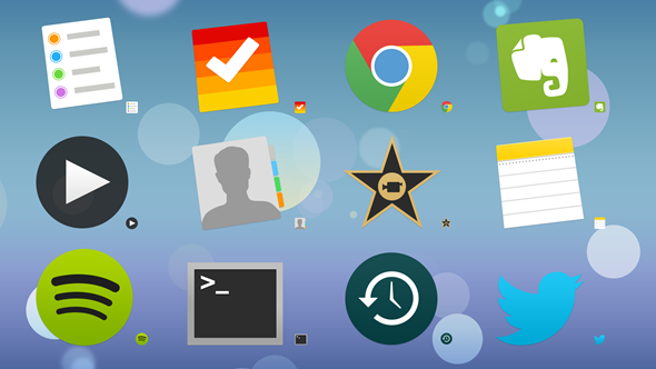
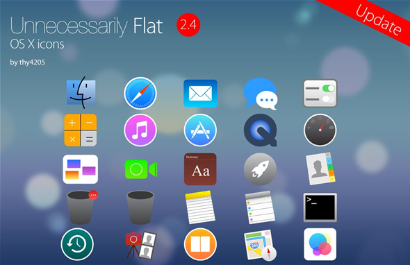
OS X Yosemite 10.10 is expected to arrive this fall, around the same time as iOS 8, and as we continue to wait for the update to appear at the Mac App Store, be sure to check out these nicely polished icons and leave your thoughts with us below.
And oh, which one is your favorite?
You can follow us on Twitter, add us to your circle on Google+ or like our Facebook page to keep yourself updated on all the latest from Microsoft, Google, Apple and the Web.

