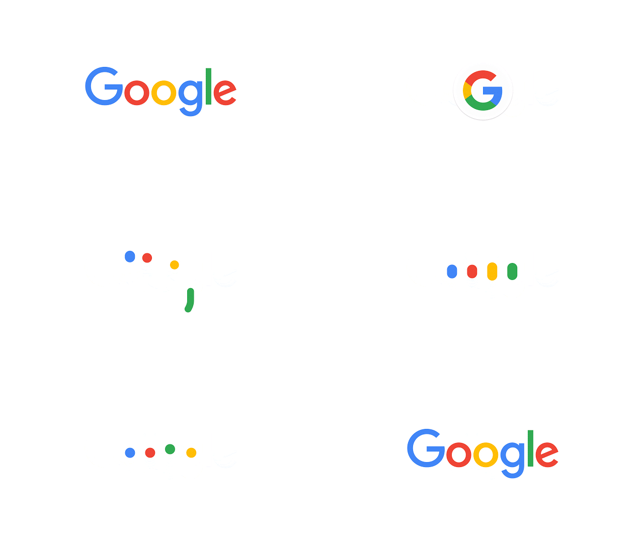
This is just in. After major restructuring under Alphabet last month, Google today has launched a brand new logo with major emphasis on the capital letter “G” further confirming the fact that “G is for Google”.
Google’s been tinkering with its logo since its inception, but todays change reflects an altogether giant leap. The software giant does continue with the four colors which it has stuck to since 1999, but the latest move makes the logo much flatter, yet bolder with a new font face as well. There’s also some striking resemblance to its parent company’s – Alphabet – logo here as well, but this should not be a surprising discovery, given that Alphabet would want a harmonious design language for all of its subsidiaries across the board.

Here’s Google’s explanation behind the change:
It doesn’t simply tell you that you’re using Google, but also shows you how Google is working for you. For example, new elements like a colorful Google mic help you identify and interact with Google whether you’re talking, tapping or typing. Meanwhile, we’re bidding adieu to the little blue “g” icon and replacing it with a four-color “G” that matches the logo.

If you fire up your desktop or mobile web browser and point it to Google’s home page now, you will be greeted with a nifty little animation with the purpose of letting you know that things are about to change. As Google puts it, “We think we’ve taken the best of Google (simple, uncluttered, colorful, friendly), and recast it not just for the Google of today, but for the Google of the future.”
Changes should be reflected across all of Google’s platforms and apps soon.
So, what do you think of Google’s new corporate logo?
(source: Google)
You can follow us on Twitter, add us to your circle on Google+ or like our Facebook page to keep yourself updated on all the latest from Microsoft, Google, Apple and the web.

