It seems to have been in development for longer than iOS 7.0 itself, but the 7.1 update to iOS is now here, and even though it’s not got all the gusto of a big point-0 release, there’s still a fair few changes gone into an offering that many will be pleased to see arrive.
It’s safe to say that not all of the changes brought in iOS 7.0 were well received, and some were downright despised. In this subsequent release, Apple has tried to squash some of the bugs and tweak some of the areas of iOS that have irritated users post-7.0, but it’s this new release that should offer a more rounded experience to those of us that have lived with iOS 7.0.x for far too long.

We’re not going to go through this release with a fine tooth-comb, mainly because most of the changes are so small it’s debatable whether most people will even notice them. Instead, we’re going to focus on a select few that we feel will enhance the iOS experience considerably, especially given what came before iOS 7.1.
So let’s get started.
I can’t believe it’s not butter
With iOS 7 Apple made some pretty huge changes to the way the user interface was put together, but it also completely altered the way we interact with it. More swiping gestures for moving between menus and the like arrived, and new zooming and panning effects came along with them. The idea was to give iOS 7 a feeling of depth, and while it managed just that it had the unfortunate side effect of making everything feel… slow. Even on a brand new iPhone 5s or iPad Air, iOS 7 can feel labored and we often found ourselves waiting for an animation to finish before we could carry on with what we were trying to do. That’s been reduced considerably through the beta process, and thankfully iOS 7.1 feels much smoother, faster and less like it’s running around in treacle than its predecessors. If you wanted Apple to make its animations faster or simply cut the time it takes for you to be able to interact with the screen again, then you’re in luck.
It ain’t so square anymore

Part of the iOS 7-ification of our iPhones and iPads was the more round appearance that many visual elements were treated to. The cellular reception strength indicators are a prime example of that, and with iOS 7.1 that trend has been carried on into other areas. Answering a call will now be a case of sliding a round ‘answer’ button rather than tapping the big rectangular slab of green that we have become accustomed to.
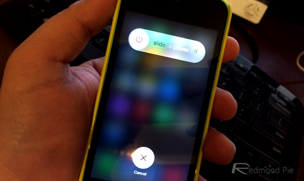
The ‘slide to power off’ slider is now no-longer bright red and circular cancel button will be presented at the bottom of the screen in white. Everything’s just… rounder. Even elements that were already circular like the Phone app’s dialer has had a spruce up, with color gradients in effect.

Gone is the big rectangular ‘call’ button too, replaced with the now obligatory circular variety instead. It’s almost like someone on the iOS team had a side bet about how many different circles they could get into this release.

Apart from that, you can now set iOS 7.1 to show button shapes instead of blue text floating over a white bar, by navigating to Settings > General > Accessibility and toggling Button Shapes.
A (key)pressing engagement
The iOS keyboard doesn’t need all that much work if we’re being honest, and it seems Apple agrees. With iOS 7.1 we still don’t have any of the fancy predictive text features that Android users are so fond of, but we do now have keys that are decidedly more bold in their appearance.

So there’s that at least. If you were looking for sweeping changes though, you’re probably going to be somewhat disappointed. Following early betas Apple has removed the option to change the keyboard’s color too, so there’s not even that to play with!
A shot in the dark
Apple has given its Camera app some love in this point-0 release too, with HDR getting a makeover. Now, after choosing ‘HDR Auto,’ the app will automatically choose to use HDR only when it thinks it will be of benefit. That means that you won’t be switching HDR on and off all the time, simply opting to let iOS make the decisions itself. We’ll have to see how well that works in practice, but in theory at least it has the potential to be super awesome. Oh, but there’s a negative too; it’s only available on the iPhone 5s. Bummer.

And oh, iOS 7.1 lets you upload burst shots straight to your Photo Stream, which is great if you want to litter your stream with photos of someone face planting on the pavement, like a GIF image. You get the idea right?
Keep me notified
A small change, but with a big impact here. Now, once iOS 7.1 is installed, answering a FaceTime call on one device will automatically clear the call notification on all other devices that the account is linked to. It doesn’t sound like much, but if you’ve got a Mac or two and an iPad and iPhone as well, this is a big deal. Much bigger than it may seem at first blush. Now Apple just needs to sort all of its other notification syncing problems out, too.
Even more UI tweaks

Control Center has gotten a nice facelift, too. The slide up gesture feels more polished and comes with a new bounce animation which is rather nice. And also, Control Center now shows which app is playing music, which is a big plus in our books.


Notification Center has also received some UI polish. The bold fonts are there too, and if you don’t have new notifications, then iOS will slap a ‘No Notifications’ text at your face. Apart from that, you get the new and shiny Yahoo logo in the Today tab and the same new logo in the Weather app. The new Flickr logo also makes a cut in iOS 7.1, too.

And yes, like we mentioned before, the ‘slide to unlock’ text on the lock screen looks abundantly fresh and a much more metal sight to look at.

A subtle but nice addition in iOS 7.1 is that it now allows you to turn off parallax effect on the wallpaper. When you’re setting a new wallpaper on your lock or home screen, simply turn off Perspective Zoom.
")
Bold fonts aren’t just limited to some UI elements in iOS 7.1. They go deep inside the realms of iOS, in apps like Safari etc.

And oh, did we mention that the Safari browser has a search bar with new wording on it? Yup, it’s there too.

The Music app has gotten a slight lick of paint too, although not noticeable until we mention it here. At the Now Playing screen, the Repeat Song and Shuffle buttons look a lot more prominent than before, which is a great sight.

And speaking of music, iTunes Radio has gotten a new ‘New’ button, too.

The ‘Choose Filter’ portion of the Photos app has gotten a slight facelift, which is noticeable, if you ever use iOS’ built-in filters that much.
Less greens
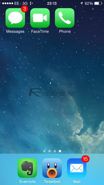
With iOS 7.1, Apple is definitely toning things down a bit, and if you look at the stock icon apps, such as the Messages, FaceTime and Phone, you’ll notice that the shocking green tint which Apple used in the first release of iOS 7 is now gone. The new green is slightly less of an eyesore and is definitely a welcome addition to the roster.
A lot less whiter than before

While iOS 7 is painstakingly white for the most of us, but Apple understands that it can get white beyond belief at times. And iOS 7.1 comes with the option to tone down that whiteness by heading over to Settings > General > Accessibility > Increase Contrast and then toggling on the Reduce White Point or Darken Colors options.
Calendar is a lot more useful / eventful

If you make use of the native Calendar app, like us, then you’ll be pleased to know that in month view, you can display your events much more prominently. And to make things even nicer, Apple has tossed in country-specific holidays directly into the calendar, so you know exactly when you’re going to slack off for the day.
Touch ID is front and center

Touch ID is now on the face of the Settings app rather than being tucked away from view. This is a nice addition to those who are constantly fiddling around with Touch ID.
It’s all coming together
It’s important to remember that this isn’t a ‘big’ release for iOS, but at the same time it has more riding on it than a usual point-one offering would. With iOS 7.0 being so disappointing in a variety of ways, this new iOS 7.1 fixes or at least improves most of them.
There are obviously changes that we’ve not mentioned here already like improved Siri voices, and tap and hold the Home button to make Siri listen to you, with more natural tones in some countries and the like, but we’ll let you find some of the alterations for yourselves.
After all, that’s part of the fun isn’t it?
Here’s a video walkthrough of the changes that come with iOS 7.1:
Subscribe to our YouTube channel for more videos.
You may also like to check out:
You can follow us on Twitter, add us to your circle on Google+ or like our Facebook page to keep yourself updated on all the latest from Microsoft, Google, Apple and the Web.
