

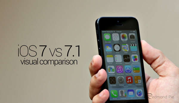


iOS 7.1 hit the scene a couple of days back, and since then, iPhone, iPad and iPod touch users have slowly been digesting and familiarizing themselves with the various new features. As well as CarPlay, which was alluded to at the Geneva Motor Show late last week, there have also been notable improvements to features like Siri, and with some aesthetic tweaks to boot, we take a look at how the new Apple software stands up, from a visual aspect, against the preceding iOS 7.
It may have become something of a cliché in tech circles, but the iOS 7.1 update certainly fits the "evolutionary, rather than revolutionary" archetype, with Apple having done a lot of housekeeping and feature-refining rather than stepping in with anything to grandiose. Nevertheless, it’s noteworthy enough to warrant its very own walkthrough, which you’ll find at the foot of this post, and below, we take a peek at some of the new features and alterations of iOS 7.1 versus iOS 7.
These are only visual comparisons, but if you have yet to update, give a clear idea of what you can expect if you do decide to take the plunge, and if you’ve already become so accustomed to iOS 7.1 that you’ve effectively forgotten what’s new and what’s not, then these shots should give a sense of perspective.
As you can see, much more effort has been made to circularize various UI elements, which marks a distinct departure from some of the lingering remnants of iOS 6:
New round ‘Call’ button with more transparency in UI
New ‘slide to answer’ slider
New round ‘End’ call button
New ‘slide to power off’ slider
The Control Center, a newly-implemented, much-needed iOS 7 feature, has also been touched-up with iOS 7.1, adding some minor, but necessary alterations. As you will notice next to the screenshot from iOS 7, it’s nothing too extreme, but I think you’ll agree, makes the feature both cleaner potentially more functional:
Subtle change in Control Center UI
Many, many other minor areas have also been given something of a freshen up with iOS 7.1, and while not all of these subtle little tweaks will have caught your eye upon updating, the comparisons with iOS 7 show just how much attention to detail Jony Ive and his design team have been paying:
‘slide to unlock’ now looks more metal
New Perspective Zoom label while choosing a new wallpaper
Bolder keyboard keys
A better view of calendar events in default Calendar app
A slight facelift given to the ‘Choose Filter’ section in Photos app
Auto HDR in Camera app
New Flickr logo in Settings app
New Yahoo logo in Notification Center
‘No Notifications’ text in Notification Center
‘No Missed Notifications’ text in Notification Center
Touch ID is now at the face of Settings app
You can enable ‘Button Shapes’ for navigation
New text in the address / search bar
Messages, FaceTime and Phone app icons are less strikingly green
Repeat and Shuffle buttons get a lick of paint
A new ‘New’ button in the My Stations section
Do you like the visual updates Apple has made to the iOS software? Let us know by dropping a comment below!
You may also like to check out:
- Download iOS 7.1 Final IPSW For iPhone And iPad [Direct Download links]
- iOS 7.1 Features: Here’s What Is New [Video Walkthrough]
You can follow us on Twitter, add us to your circle on Google+ or like our Facebook page to keep yourself updated on all the latest from Microsoft, Google, Apple and the Web.