

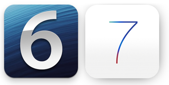


So, after much deliberation, rumor, concept and a little bit more rumor, Apple has finally shown the world what exactly Jony Ive’s vision of software design is with the introduction of iOS 7. It’s clean, crisp, and certainly a great deal brighter than ever before, but, new features aside, does it actually look better, and how does it compare? Here, we assess whether the clean lines and anti-skeuo approach is as much of a step forward as Apple has portrayed.
As noted by my colleague Oliver in his post: ‘iOS 7 on iPhone 5 – First Impressions’, it certainly is bright, and echoes John Gruber’s pre-WWDC utterances that iOS 7 would be polarizing. Some seem to love it, others are completely bemused, and while the features offered inarguably represent the biggest version leap hitherto, the look is proving fairly divisive.
Although I wouldn’t say I loathed the old look as much as Jony Ive is reported to have, I did personally feel the old look was becoming dated. Aside from a minor shake-up of the Music app and a few other mundane alterations, iOS was becoming a rather tired rhetoric; a mere re-hash through the generations with a few rather uninspiring features jumped-up and decorated as ‘marquee.’
iOS 7 is none of that. Apple has really worked at changing just about everything, but like the Windows 8 OS to which iOS 7 is now drawing comparisons thanks to the bold colors and straight lines, it feels a little too much, too soon.
I am of the opinion that iOS 7 is an improvement on iOS 6 in terms of features, but the look is not selling itself to me at all. In-app, the clean-up job is plain for all to see, and while there are some stand-outs (the Weather app, for example, is quite delightful), it would appear as though Apple has gone from cruising, coasting, and relaxing on one look and taken things too far the other way, bringing an altogether offensive, rather vulgar brightness that users without Ray Bans cannot turn off in preservation of their eyesight.
Take a look at the screenshots below and have a peek for yourself:
Home Screen
Phone App, with incoming notification banner.
Phone Calling
Stocks App
Settings.app
Spotlight Search
Weather App
Game Center
Clock App
Folders
Apple Maps
Compass App
Notes App
Reminders App
Newsstand App
Calculator App
Calendar App
Sharing Sheet
Sharing Photos via Twitter
Lock Screen with Notifications
Mail App
App Store
Notification Center
Multitasking Switcher
Music App
Camera App
Siri
Messages App
Overall on the whole, iOS 7 may look better than its predecessor, but I think Apple has tried way too hard. It would be nice to see things toned down through the next handful of betas before the final release, bringing back some of the reserved charm which has helped iOS rise to such prominence.
What do you think, will you be sticking with iOS 6 for as long as you possibly can? Or has the new-look iOS 7 completely won you over aesthetically? Take the poll and let us know!
Do leave your comments below!
You may also like to check out:
- iOS 7 Features Walkthrough [VIDEO]
- Download iOS 7 Beta 1 For iPhone 5, 4S, 4, iPod touch 5
- iOS 7 vs iOS 6 – App Icon Comparison
You can follow us on Twitter, add us to your circle on Google+ or like our Facebook page to keep yourself updated on all the latest from Microsoft, Google, Apple and the web.