Prior to iOS 5, it’s fair to say that the system of notifications within Apple’s mobile and desktop software left quite some to be a desired. Users of the Cupertino’s mobile operating system had perhaps suffered slightly worse, but the infrastructure in which users were notified of new e-mails, messages, and other such tidbits, has been crying out for some sort of discipline and stability. The Notification Center, which has since trickled out to Mac thanks to the divisive – but ongoing – iOS-ification of OS X, has certainly done that, but to many, it’s still a long way from the level it should be at.
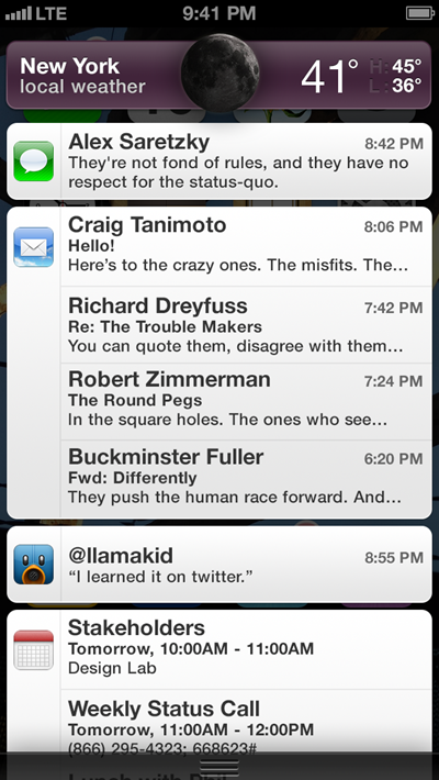
We’ve already seen several attempts by fans, designers and developers to "suggest" new ways the one-man-show that is Jony Ive can enhance and improve Apple’s software prowess. In the latest, Brooklyn-based designer Alex Saretzky takes the generally-lauded implementation of the notification banner, and increases its prominence within the Notification Center in general.

But don’t mistake this as a simple aesthetic tweak for purpose of vanity; Saretzky envisions an altogether better-functioning experience – particularly on iOS. Of course, he does begin, like many have since the ousting of iOS SVP Scott Forstall, by talking about how much we’ve all hated the skeuomorphism, despite the fact that few had complained until last month’s executive shake-up. But I digress..
Saretzky also taps into another glaring problem with the Notification Center – the minuscule "close x buttons" that need to be tapped twice in order to work. Not only does the surface area fall short of the iOS Human Interface Guidelines (which recommend at least 44 squared pixels), but in the likely eventuality you miss the "x", you hit a banner.
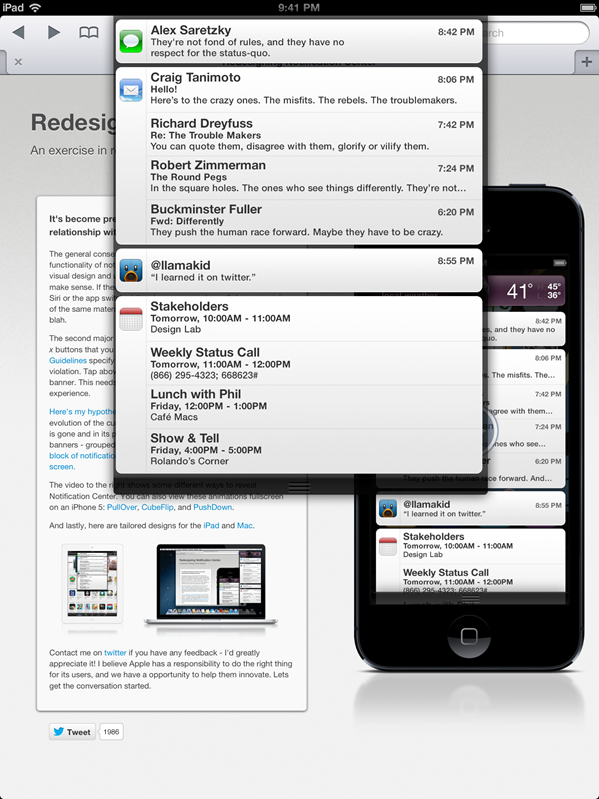
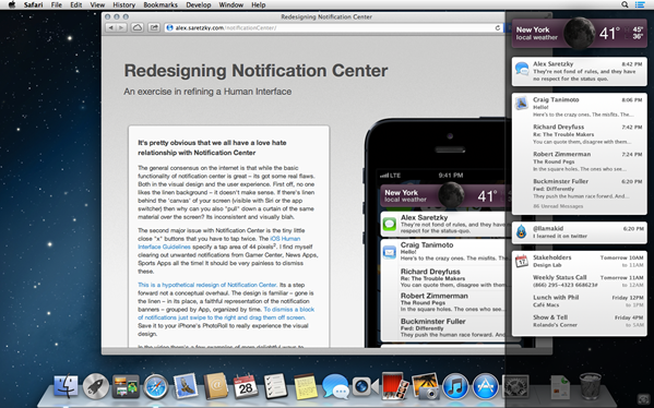
For those that don’t like the current fiddly, somewhat painful experience, you’ll likely be a fan of Saretzky’s proposition. The linen has disappeared, and the entire Notification Center has been infiltrated by well-organized banners. Said banners are grouped by app, and sorted chronologically for added convenience. Here’s what they look like on iPad and Mac:


While banners may not ultimately be the solution, the proposed system looks a great deal better than what is currently on offer. Everybody seems to be waiting with baited breath at what Jony Ive is cooking up in his mystical lair over in Cupertino. He’s responsible for whipping iOS into shape, and although his influence on OS X’s interface isn’t thought to be as strong, the Mac software seems to be borrowing more than a few features from its mobile incarnation.
(via Gizmodo)
You can follow us on Twitter, add us to your circle on Google+ or like our Facebook page to keep yourself updated on all the latest from Microsoft, Google, Apple and the web.

