Apple has historically done a fairly impressive job of iterating with its iPhone hardware, resulting in a new device every twelve months, typically with the inclusion of new features and functionality. The same can be said from a software perspective with iOS, but with iOS 11 expected to be announced at this year’s Worldwide Developers Conference, could we see the company going one step further with iOS and revamping the Home screen experience?
Matt Birchler hopes so, and has shared his vision for how that could look and work with an iOS 11 Home screen concept.
Birchler has previously put his ideas for the future of iOS into practice by redesigning what he feels an iOS 11 Lock screen should be like, but has now turned his attention to the iconic Home screen, and actually makes some fairly strong suggestions which would likely resonate with a lot of users.
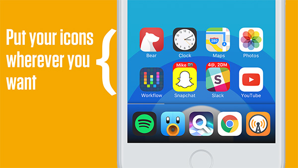
To begin with, he believes that Apple should use iOS 11 to break the trend of allowing app icons to be only placed into fixed grid positions on the display. That would allow users to place installed app icons wherever they want on the display; a capability which is heavily utilized in the jailbreak world.
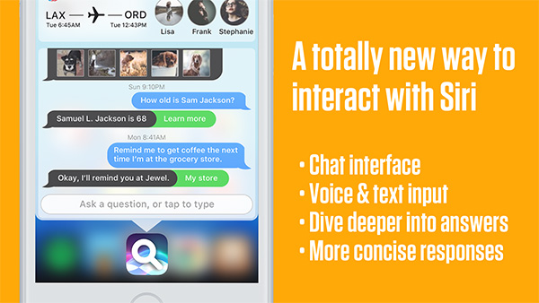
In addition to that subjective improvement, the developer also imagines a version of iOS with more powerful and capable widgets that are extended beyond the Today screen of the device, as well as richer notifications containing more information with more user-interface capabilities, and a smarter, more powerful Siri installation which would hopefully lead the race for artificial intelligence in digital assistants.
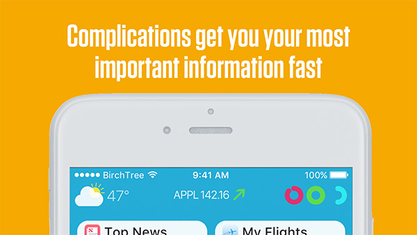
All of those things would likely be passionately received by iOS device owners, but it is perhaps the idea of Complications for iOS which defines this concept:
When Apple released the Apple Watch in 2015 I figured it was only a matter of time before they brought complications to iOS as well. It’s been 2 years and there has been no movement in this space, but I hold out hope.
In this mockup, complications would be configured just how they are on the Apple Watch, and you would be able to choose between having 3 small complications, or one large (wide) complication on the top of your home screen.
These all have realtime data that’s relevant to me, and this would go a long way to making the home screen more than just a simple app launcher.
As it stands, the Home screen on an iOS device is not much more than a launching experience. Something which really feels like a missed opportunity giving the endless potential capabilities.
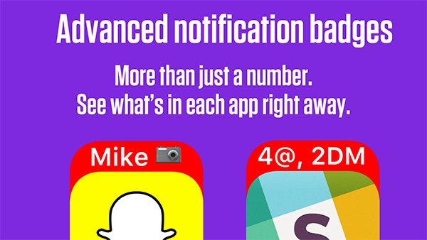
Having app icons which seep out additional, user-focused information and data is definitely a strong idea, but is it one that Apple would ever entertain? In the short-term, probably not.
(Source: BirchTree)
You might also like to check out:
- iOS 11 Beta Download, Rumors, Features, Release Date [Everything We Know So Far]
- Updating To iOS 10.3 Will Make Your iPhone Feel Faster And Snappier, Here’s Why
- How To Downgrade iOS 10.3 On iPhone Or iPad
- Download iOS 10.3 Final IPSW Links For iPhone And iPad
- Jailbreak iOS 10.3 / 10.2.1 For iPhone And iPad [Latest Status Update]
- Download: Pokemon Go 0.59.2 APK For Android Announced, Here Are The Details
You can follow us on Twitter, add us to your circle on Google+ or like our Facebook page to keep yourself updated on all the latest from Microsoft, Google, Apple and the Web.
