One of the easiest and the most common ways to make a reflective surface is through the use of visual brushes and opacity masks. In this step-by-step tutorial, I have attempted to teach the absolute beginners how to make an image reflection in WPF and giving a 3D feel to it.
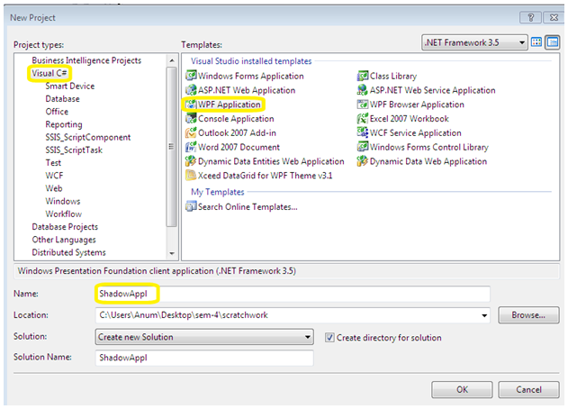
Step 1. Create a new WPF Application project in Visual Studio 2008.
- Create a new project.
- Select VISUAL C# from the left pane and WPF APPLICATION from the right.
- You can rename the application if you want to.
- Click OK.
Step 2. Ensure the necessary windows are visible in Visual Studio 2008 IDE.
- Click VIEW in the toolbar.
- Select the four options highlighted:
- Solution Explorer
- Error List
- Properties Window
- Tool Box
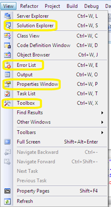
- The Screen will look similar to the one below:
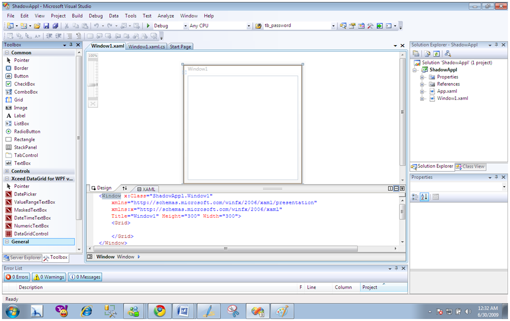
click on the image to enlarge.
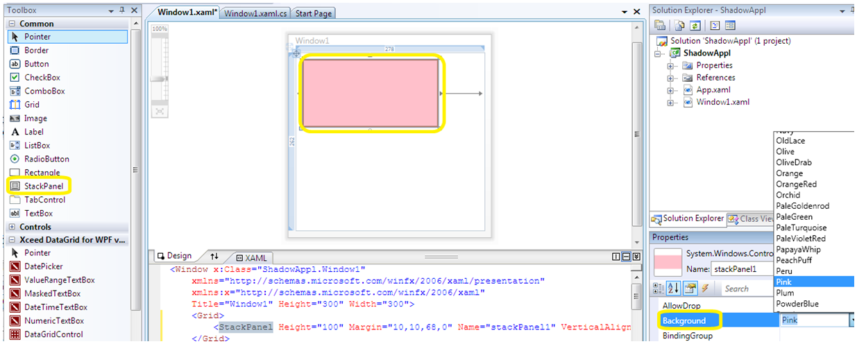
Step 3. Create the stack panel:
- Double click on the STACKPANEL in the toolbox.
- A border will appear in the window representing the boundary for the stack panel.
- In the Properties Window on the right, change the background color to any you may like.
click on the image to enlarge.
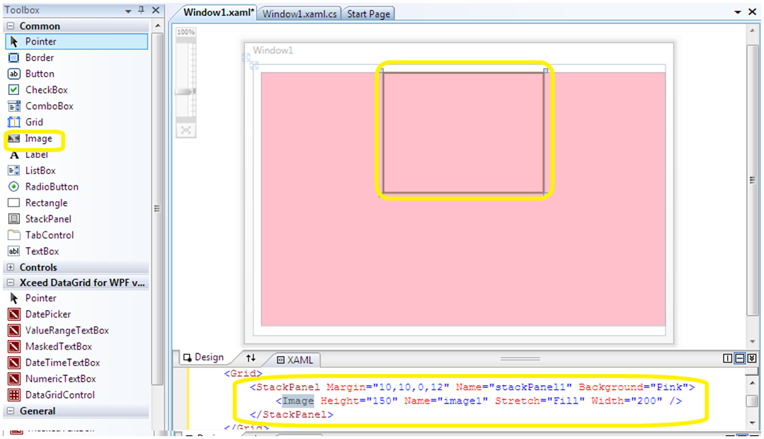
Step 4. Add Image to the stack panel:
- Click on the stack panel in the window.
- Double click IMAGE in the toolbox.
- A border will appear inside the stack panel representing the boundary for the Image.
- Alter the dimensions of the image in accordance with the size you want.
NOTE: Notice the automatic changes in the XAML code of the design. The image tag is between the tags of stack panel which means the stack panel contains the image.
click on the image to enlarge.
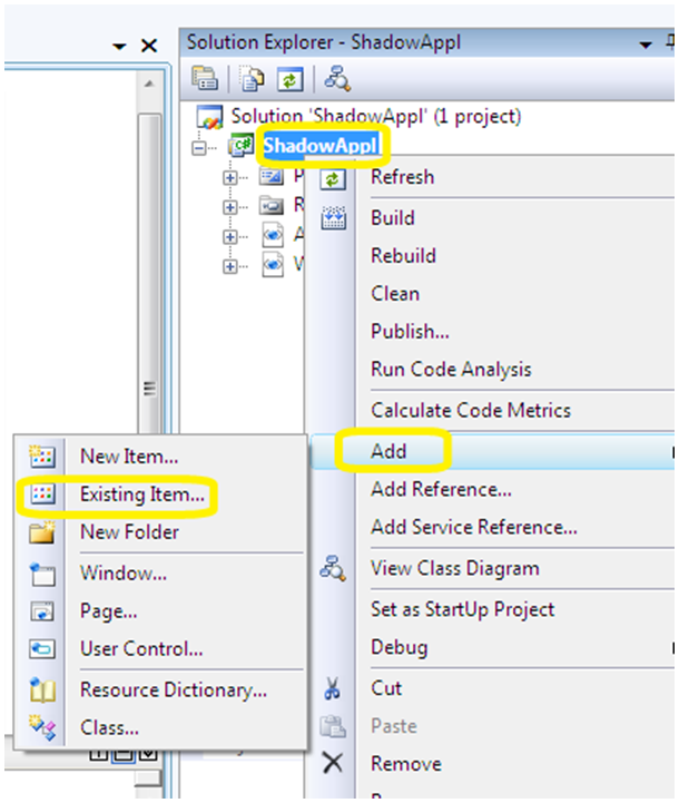
- Right click on the name of your application in the solution explorer.
- Click ADD
- Click EXISTING ITEM
- Select the image to be added in the project and click OK.
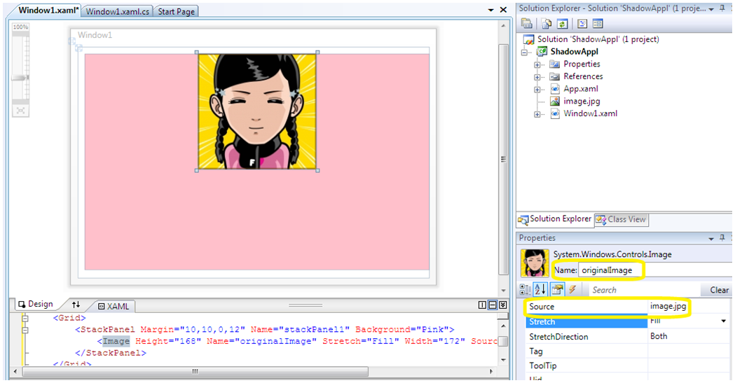
- Click on the image border in the window
- Rename the image in the properties window to “originalImage”
- Set the source to the name of the image that you added to the project previously.
click on the image to enlarge.
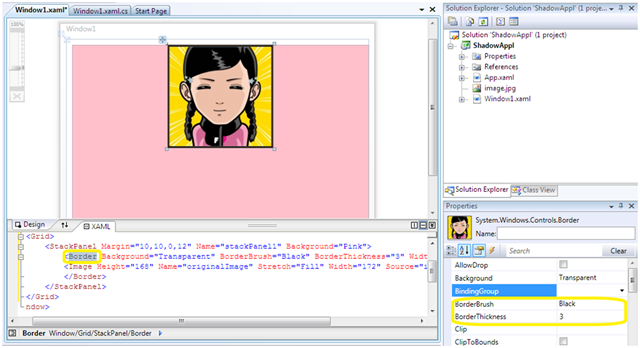
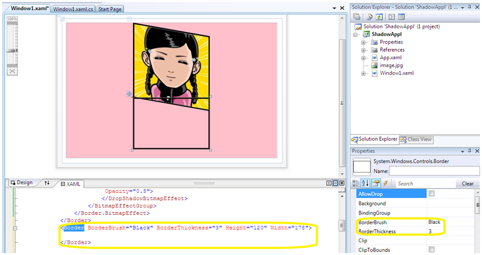
Step 5. Set the Border around the original image:
- Create border tags around the image tag as follows:

- Double click on the border tag in the XAML code
- Alter the border brush to black (or any other visible color) in the properties window.
- Alter the border thickness to 3 for further visibility.
- The border will appear as a thick black line. Drag the corners of the border and adjust it to fit the image.
click on the image to enlarge.
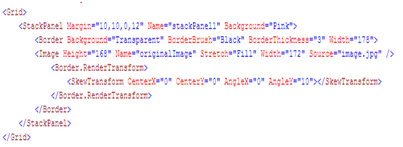
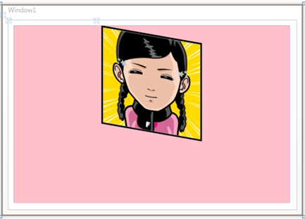
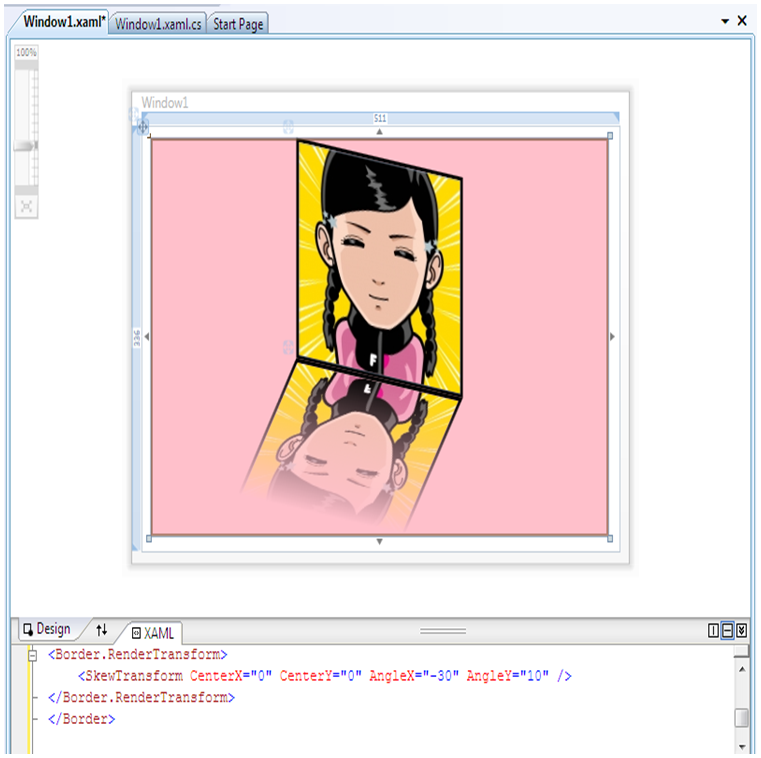
Step 6. Skew the original image:
To skew the original Image we use RenderTransform which is a display transformation used to modify how an object is rendered (displayed) by the UI system.
A Skew transformation is then used to skew the image by specific X and Y angles.
- Within the border tag, the following code for RenderTransform and SkewTransform is incorporated:
click on the image to enlarge.
NOTE: The centreX and centreY : centre point around which the transformation should take place; AngleX and AngleY: skew angle of X-axis and Y-axis respectively. Check out this MSDN article for a better understanding of Skew Transformation.
- Recheck and adjust the dimensions of the stackpanel, border and image (if needed).
- Press F5.
Step 7. Add the shadow effect to the original image
- Add the following code with in the border tags in the XAML code.
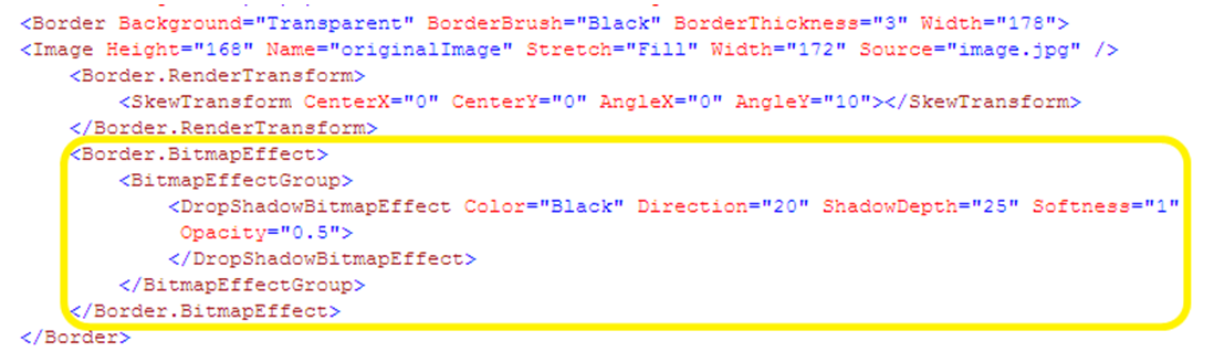
NOTE: There are other Bitmap Effects supported in WPF as well: bevel, blur, embossed, outerglow etc
To understand how the Direction property works, here is the dropshadow direction diagram.
In order to view the drop shadow effect, you will have to run the application(the effect will NOT be visible in the window)
- Press F5
Step 8. Create a Border and image of the reflection:
- Create a border tag with in the tags of stack panel.
- Double click on the border tag in the XAML code.
- Alter the border brush to black (or any other visible color) in the properties window.
- Alter the border thickness to 3 for further visibility.
- Resize the border by dragging its corners.
NOTE: The border size should be smaller than the size of the original image. If both the borders are of the same size, then the reflected image(when skewed) will seem longer than the original.
click on the image to enlarge.
We will use a visual brush for the reflection. With a VisualBrush, you can define a simple or complex UI element and assign it to the VisualBrush’s Visual property. Then you can paint other parts of your screen with this conglomerate brush. We then transform it in order to flip the image upside down.
- Code the following within the border tags above:
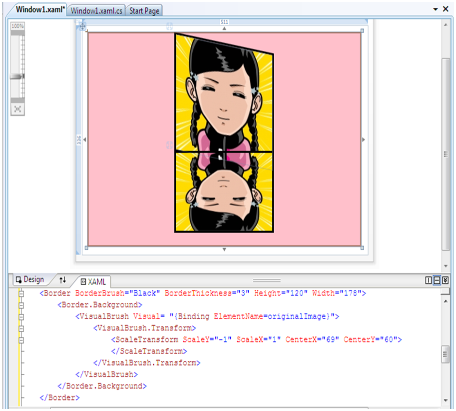
NOTE: The ElementName is the name of the image (originalImage in this case) and NOT the source image(that we added in the project)
The CenterX and CenterY for the scale transformation are calculated by halving the width and height of the border respectively.
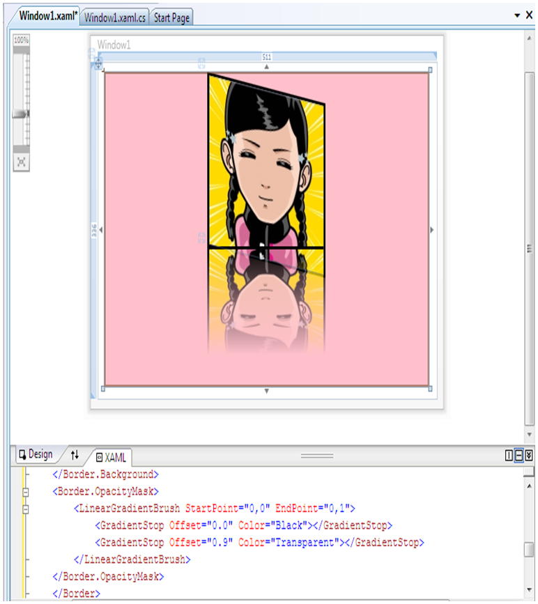
Step 9. The Reflection Effect:
We add an OpacityMask to the Border. With this in place, we can make the reflected image fade out into the background with the help of a gradient brush.
- Add the following code with in the tags of the border of the reflection:
click on the image to enlarge.
NOTE: The default linear gradient brush is a diagonal line(from 0,0 to 1,1). However we want the fading effect to be vertical- hence the endpoint is (0,1) (imagine the vertical line from 0,0 to 0,1 in the co-ordinate axis)
The offset value of 0.9 for transparent indicates that 90% of the image will be visible and the rest 10% faded.
Check out this MSDN article for a better understanding of the linear gradient brush.
Step 10. Skew the reflected image:
- Use the skew transformation as for the original image:
FINAL OUTPUT
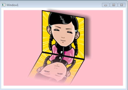
And we are done! The final output of the beautiful looking reflected image can be seen above. Here is the original article that I referred to while writing this step-by-step tutorial. Feel free to ask me any questions should you run into any problems following my tutorial above. Cheers!