With Windows 8 set for launch later this year, the debate is still raging on about the relatively radical design changes implemented by Microsoft in the OS. Now, before I go on, I want to note that I’m not the type that’s resistant to change. Improvement and progress is welcome, and I really don’t mind adjusting to changes of any sort. But, the issue isn’t with people like me; it’s with users that struggled to understand Windows as it was before these radical changes.

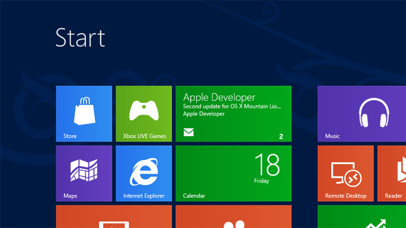
If a company like Microsoft are going to make changes to a product like Windows, they’re going to have to ensure that these changes are sufficiently intuitive for normal users to adapt to. And of course, this shouldn’t be a ball and chain that prevents them from making changes at all, as the OS should be intuitive to begin with. However, I feel that Windows 8 isn’t, and I’m already weeping in advance for all of the users that will panic when something as familiar as the Start button is missing on their new PC, for one. Yes, there is something in its place: The new Start screen, and a “Start Preview” that can be toggled by hovering in the bottom-left corner of the screen, but there’s nothing to indicate upon staring at the screen that these things exist.
Without exploration, there’s no way to tell that something happens when hovering over the hot corners, and I think that this will be an issue. Back to the topic of the start menu; it’s just, gone. Such a major, iconic paradigm of Windows has been removed with nothing to indicate the existence of its successor. So, assuming that people do manage to find the Start screen (likely after a tech support call to either their PC manufacturer or tech-savvy family member), they’re going to eventually inadvertently stumble upon one of those snazzy new Metro apps. They’re going to be trapped. See, with yet another paradigm removed – the infamous “x” in the corner of the window – Metro apps will essentially serve as flytraps of disoriented users.

Let’s hope that they at this point realize that the corners can be toggled so that they can get out, either by using the Charms bar or the new app switcher. In this post, I’m not even voicing my thoughts on the actual changes themselves or the aesthetics of Metro. In fact, I think it could work if more polish and time was put into the OS to make these new features more intuitive and discoverable (which they seem to be working on; apparently, hot corners are going to be a bit easier to toggle come the Release Preview.)
We shall see.
For discussion on this topic: Check out the threads on Facebook or Google+.
You can follow us on Twitter, add us to your circle on Google+ or like our Facebook page to keep yourself updated on all the latest from Microsoft, Google, Apple and the web.

