Last month we brought you a proposed new way for Apple to handle notifications and popups inside iOS. Designed by Shawn Hickman, the system used the Spotlight page to list notifications ready for taking action on. We liked it, and we hoped Apple would use it when revamping notifications in iOS 5. But now there’s a new kid on the block – and it’s lovely.

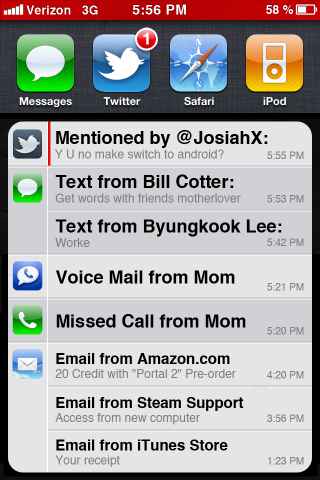
Designed by David Connell, the new mockup uses the multitasking tray as the starting point for its notification management. Using a swiping gesture the notification list would be opened, with red lines indication unread messages. It’s a simple, elegant solution that works slightly differently to the way presented by Hickman.
When a new message arrives the top bar would turn red to notify the user, meaning new messages wouldn’t get missed.
If you miss or ignore the initial notification, the bar still glows red, but resumes displaying the usual information. The complete history is accessible through the multitasking bar. Double tap the home button to bring it up…
We’re encouraged by the different ways notifications could be done. Here’s hoping Apple is paying attention and has their own UI boffins working on the problem too!
(Thanks, Awais Imran!)
You can follow us on Twitter or join our Facebook fanpage to keep yourself updated on all the latest from Microsoft, Google and Apple.
