While from the outset, it does appear that Apple and Samsung are fighting over the design of “black rectangles”, newly released evidence from the courts shows just how blatantly Samsung copied Apple’s design ideas*. Check it all out after the jump.
Six pieces of evidence were presented by the Apple legal team in court yesterday. These pieces are actually images of icons used by Apple in stock iOS apps – Phone, iTunes, Contacts, Photos, Notes, and Settings – compared with their equivalents in different Samsung smartphones that use the custom TouchWiz user-experience which runs on top of Android.
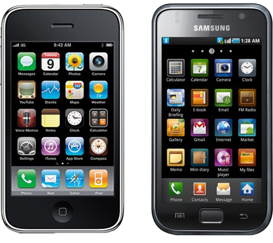
As you can see in the images embedded below, the extent to which Samsung has copied the icon design is embarrassingly shameful. Using a traditional image of older, landline phones is fine, but Samsung doesn’t stop there. Their icons have the almost the exact same green color and pattern. This is repeated in the TouchWiz music app icon which has a CD behind a music note that looks exactly like the iTunes icon from a year ago. The same goes for their photo gallery app which uses – of all the flowers in the world – a similarly yellow sunflower that Apple uses for its Photos app. Settings too uses a mechanical gear.


Many will argue that the symbols associated with these apps – traditional phone, CD with music note, mechanical gears – are generic, and that is true. But Samsung could’ve made more effort to differentiate their icon designs. They could’ve used a different color and orientation for the Phone icon, a different music note for the Music icon and a wrench / screwdriver for their Settings app icon, but they did none of that.
We’ve only posted three of the six evidence documents here. You can check out the rest over at CNET.
*You may have heard me saying on these pages how Apple is wrong with being so aggressive with Samsung. Well, I still believe that Samsung’s latest products – the Galaxy S III, Galaxy Note and Galaxy Tab series of Android tablets – look significantly different than any product Apple has ever released; it’s just that their older designs like the Galaxy S and the TouchWiz icons shown in these articles look a lot like Apple’s iPhone 3GS and icons on iOS.
You can follow us on Twitter, add us to your circle on Google+ or like our Facebook page to keep yourself updated on all the latest from Microsoft, Google, Apple and the Web.
